Preview image. Unlock full-res
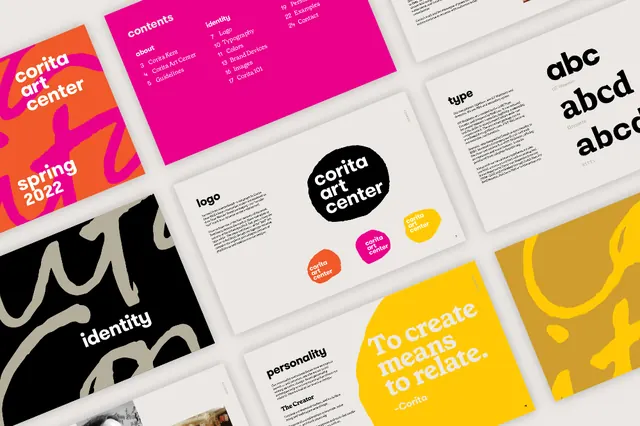
Grid of brand-guideline slides for an arts identity, pairing hot magenta and yellow color blocks with logo, typography, and personality pages around a quote slide.
Summary
A contact-sheet view of a brand-guidelines deck for an arts organization, where hot magenta and bright yellow do the heavy lifting across logo, type, and personality pages.
Visual description
Roughly a dozen slide thumbnails are tiled in a loose grid on a light ground. Recurring elements: a magenta cover with an abstract pink shape and "spring 2022", a logo lockup reading "corita art center", a black-and-white scribble/illustration page labeled "identity", a "type" specimen page, a "personality" page, large "abc / abcd" letterform specimens, and a saturated yellow quote slide set in display type, "To create means to relate." The system alternates flat color fields (magenta, yellow, off-white, black) with white documentation pages, giving a confident, high-energy but organized rhythm.
Key takeaway
Anchor a whole guideline system on two loud, near-complementary brand colors (magenta and yellow) and let white documentation pages breathe between them. Showing the deck as a grid of thumbnails is itself the move: it communicates "complete system" at a glance for a portfolio or case study.
Reuse notes
Reference for brand-guideline decks, identity case studies, and arts or cultural-org branding that wants to feel expressive without losing structure. The thumbnail-grid presentation is a strong portfolio device. Caveat: the source image is low-resolution, so individual slide text is only partly legible.
More like this




Keep what you find
A free account saves references to boards and can send you a weekly email of picks based on what you save.
To see every result, go Pro.