Preview image. Unlock full-res
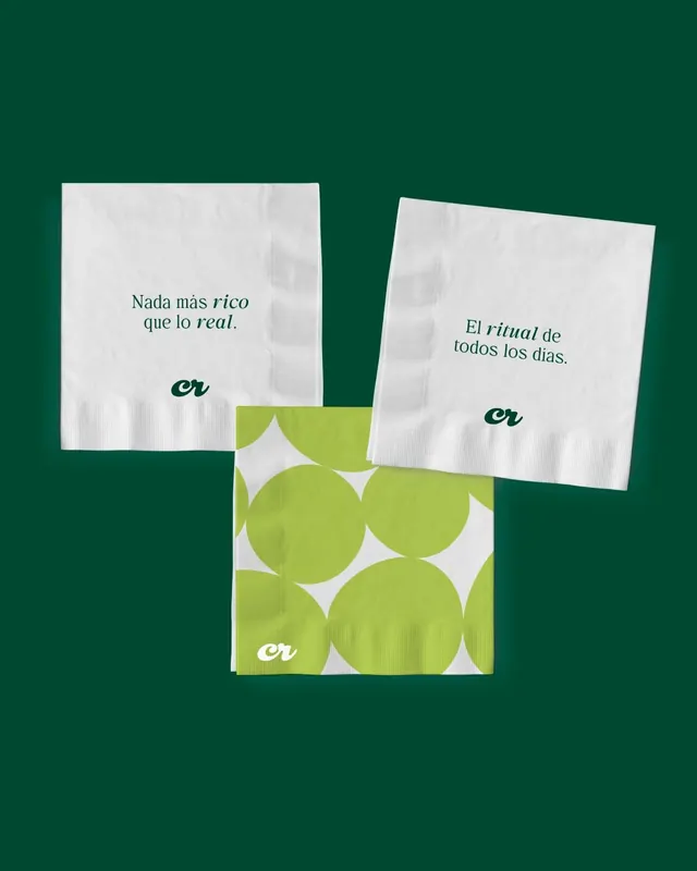
Three printed cocktail napkins for a juice or smoothie brand, two white with green Spanish taglines and one lime napkin scaled up with the cursive cr monogram as an oversized dot pattern.
Summary
A cocktail-napkin set for a Spanish-language food or beverage brand, anchored by a cursive "cr" monogram that appears small on the white napkins and blown up into a graphic dot field on the lime one.
Visual description
Three folded square napkins float on a deep forest-green background, each casting a soft drop shadow. The two white napkins are printed in the same forest green: short centered taglines set in an italic serif ("Nada mas rico que lo real." and "El ritual de todos los dias."), with the lowercase cursive "cr" monogram tucked at the bottom. The third napkin is lime green and overprinted with large white circles that read as oversized continuation of the dot motif, with the monogram reversed to white in its corner. Type stays small and quiet so the brand mark and color do the talking.
Key takeaway
The single brand element rescaled across the set: the same script monogram is a discreet sign-off on the plain napkins and a full-bleed graphic pattern on the accent one. Pairing an italic serif tagline with a casual script mark gives one voice two registers, refined and warm at once.
Reuse notes
A strong template for a hospitality, juice, or cafe identity rollout where you want printed touchpoints to feel handcrafted but cohesive. The two-tier color logic (neutral base plus one saturated accent piece) scales to cups, bags, and coasters. Works best when the brand owns a distinctive monogram that survives both small and oversized treatment.
More like this


Keep what you find
A free account saves references to boards and can send you a weekly email of picks based on what you save.
To see every result, go Pro.