Preview image. Unlock full-res
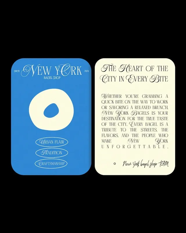
A two-panel bagel-shop brand identity with a large cream bagel symbol on cobalt blue (left), brand copy and values on cream (right), articulating artisanal tradition and urban character.
Summary
A two-card bagel-shop brand presentation: a logo panel on cobalt blue featuring a large cream bagel symbol and artisanal values, paired with a cream-colored copy panel in flowing serif display type articulating the brand's heritage and urban character.
Visual description
Two squared panels sit side-by-side on black. The left panel uses a saturated cobalt blue background with a centered cream-colored bagel (ring donut shape with the negative space centered). Above the bagel sit text elements reading "SINCE / NEW YORK / 2024" and "BAGEL SHOP" in serif outline lettering. Below the bagel are three pill-shaped ovals containing the values "URBAN FLAIR / TRADITION / CRAFTSMANSHIP" in fine serif capitals. The right panel uses a warm cream background with an extended handwritten script headline reading "The Heart of the City in Every Bite" followed by a long paragraph in serif display type (all capitals with extended descenders and ornamental terminals) describing the bagel shop's ethos. At the bottom right, a handwritten signature-style mark reads "New York bagel shop TEAM" with a small circular dot accent. The entire composition balances bold geometric simplicity (the bagel, the color split) against ornamental serif typography, creating tension between modernity and tradition.
Key takeaway
Strong color contrast (cobalt plus cream) as a signature identifier that becomes instantly ownable. The bagel as a simple, large symbol that anchors the whole system. The two-panel format separating icon/values from narrative copy, allowing both visual impact and storytelling space. Script serif typography deployed asymmetrically: structured outlines on blue, flowing display type on cream. The pill-shaped value badges as a contained, scannable alternative to full sentences.
Reuse notes
Excellent model for food and beverage brands needing to balance heritage (traditional serif, established-since messaging) with urban energy (bold color, artisanal positioning, community-forward copy). The two-panel approach works when you have both a strong visual mark and substantial brand story to tell. Best for established or legacy brands where history and craftsmanship are genuine selling points. The handwritten signature element personalizes what could otherwise feel overly designed. Works across packaging, in-store signage, and digital collateral because the mark and color palette are instantly recognizable.
More like this



Keep what you find
A free account saves references to boards and can send you a weekly email of picks based on what you save.
To see every result, go Pro.