Preview image. Unlock full-res
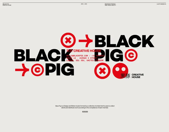
A studio identity for Black Pig Creative House setting the heavy black BLACK PIG wordmark over scattered red icons, an arrow, a target copyright mark and an X, on a warm grey field.
Summary
A typographic identity for Black Pig Creative House, a design and motion studio. The defining move is the heavy uppercase BLACK PIG wordmark repeated and overlapped across the frame, punctuated by a small kit of red icons: an arrow, an X-in-circle, a target copyright mark and a round pig face.
Visual description
A warm pale grey canvas with thin black rule and project metadata across the top ("BLACK PIG CREATIVE HOUSE", "2019-2019", "BRANDING STRATEGY / WEB, VISUAL IDENTITY", "ILLICIT DESIGN CO."). The center collages the words BLACK and PIG at large weight in solid black, set at different positions and overlapping, interleaved with bright red elements: a chunky right-pointing arrow, an X inside a circle, a bullseye copyright C, and a flat red pig-face glyph. Red monospaced contact text and Japanese kanji ("creative house") sit tucked between the letters. A small centered tagline and a "2020" copyright close the composition at the bottom. Two colors only, red and black on grey.
Key takeaway
Treating the wordmark as a repeatable, overlapping graphic rather than a fixed lockup turns plain heavy type into a flexible poster system. The tight red icon kit (arrow, X, target, mascot) gives the black type a recurring accent language, and dropping monospaced contact details and kanji into the negative space between letters adds a technical, editorial texture without new colors.
Reuse notes
A strong reference for a design or motion studio identity that wants attitude from typography alone, no illustration or photography required. The two-color red-and-black-on-grey scheme is cheap to print and reads loudly small. Works best where the brand name is short and bold enough to survive overlapping and repetition.
More like this








Keep what you find
A free account saves references to boards and can send you a weekly email of picks based on what you save.
To see every result, go Pro.