
Preview image. Unlock full-res
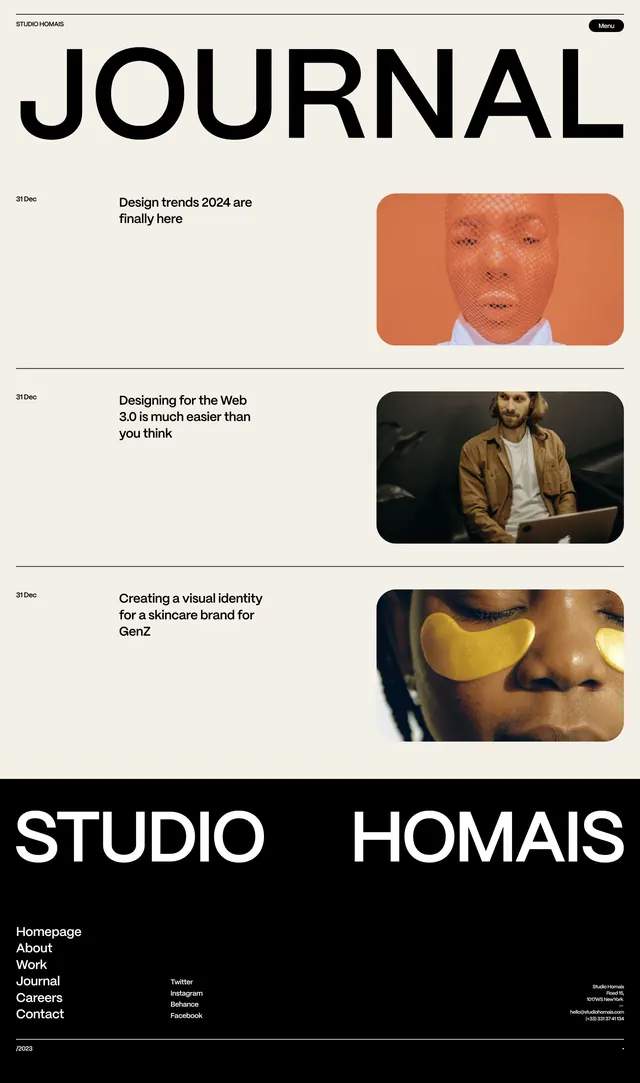
Multi-panel editorial layout alternating between saturated orange sections and high-contrast black-and-white photography, with services listed in minimal sans-serif.
Summary
Multi-panel vertical layout stacking full-width black-and-white photography against a saturated orange section labeled 'SERVICES' with sans-serif list copy.
Visual description
Three distinct panels arranged vertically. Top: grayscale lifestyle photography showing hands or objects in motion, minimal text overlay at the top in small sans-serif. Middle: a vibrant burnt-orange ground occupying roughly one-third of the height, with the word 'SERVICES' in bold sans-serif headline left-aligned, followed by a multi-column grid of service offerings in smaller gray text, centered on the orange field. Bottom: another high-contrast black-and-white product or architectural photograph, deliberately cropped to suggest continuation. The overall rhythm alternates between image-heavy and text-heavy sections. All type is set in a clean, geometric sans-serif; hierarchy is marked by weight and scale rather than color variation.
Key takeaway
Color-blocking with a single vibrant accent (orange) creates visual punch without overwhelming the layout. The alternation between full-bleed photography and a text-dense panel establishes clear information zones while maintaining design continuity. The sans-serif's clean geometry and generous letter-spacing make dense copy listing readable and refined.
Reuse notes
Strong approach for agency portfolios, design studios, or service-heavy B2B brands. The orange acts as a wayfinding anchor on multi-page documents. Works best when you have quality photography and a substantial service list. The monochrome photography naturally complements the accent color without color competition.
More like this




Keep what you find
A free account saves references to boards and can send you a weekly email of picks based on what you save.
To see every result, go Pro.