Preview image. Unlock full-res
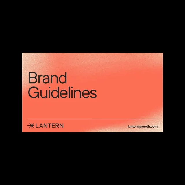
A Lantern brand-guidelines cover: a coral gradient card with a sprayed light bloom sits centered on black, titled in plain black sans-serif over a hairline footer rule.
Summary
The cover card of Lantern's brand guidelines: a single coral rounded rectangle floating on a black field, with a soft airbrushed light bloom across it and the title "Brand Guidelines" set quietly in black at lower-left.
Visual description
A landscape coral card is centered on solid black with generous black margin all around. The coral surface is not flat: a brighter peach bloom diffuses through it like sprayed light, and a fine film grain runs over the whole panel. "Brand Guidelines" is set in two lines of medium-weight black sans-serif, left-aligned in the lower third. Below it a thin black hairline rule spans the card, splitting a footer that holds a small starburst/asterisk mark beside the all-caps wordmark "LANTERN" on the left and "lanterngrowth.com" on the right. There is no imagery beyond the gradient and texture.
Key takeaway
The textured single-color card as a cover: a sprayed gradient plus grain turns one flat brand color into something that feels lit and tactile without any photography. Also the footer lockup, a hairline rule carrying mark, name, and URL in one tidy line, which reads as a reusable document-system element across later pages.
Reuse notes
A clean template for the title page of a guidelines deck, pitch, or one-pager. Drop the card on a dark backdrop so the coral glows; the same layout extends to interior dividers by swapping the title. The grain and bloom are doing the differentiation here, so keep the type minimal and let the surface carry the warmth.
More like this









Keep what you find
A free account saves references to boards and can send you a weekly email of picks based on what you save.
To see every result, go Pro.