Preview image. Unlock full-res
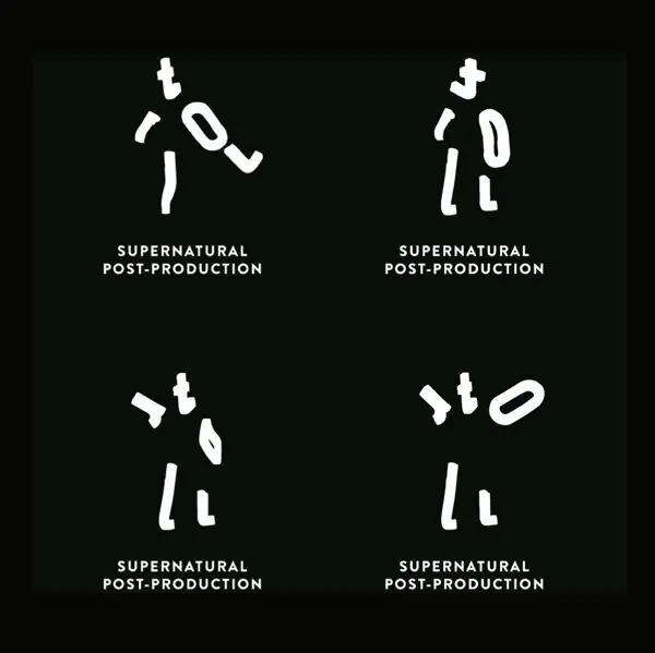
Four logo variations for 'Supernatural Post-Production' building a ghost-like figure from scattered torn-paper white shapes on black, above an all-caps wordmark.
Summary
A 2x2 grid of four logo explorations for "Supernatural Post-Production." Each mark assembles a loose human-ish figure from a handful of scattered white torn-paper shapes on a black field, so the figure feels glitchy and half-formed, fitting the supernatural theme.
Visual description
Four versions sit evenly in a grid on a near-black ground. In each, irregular white cut-out fragments (a round head form, angular limb-like slabs, small ticks) float in roughly the same vertical arrangement, reading as a standing figure that is coming apart or reassembling. The fragments shift position and rotation between the four panels, so the same character appears in different states of disintegration. Below every mark, the wordmark "SUPERNATURAL POST-PRODUCTION" is set in a compact white all-caps sans-serif on two stacked lines, tightly tracked and centered. The whole system is strictly black-and-white with no other color.
Key takeaway
Building a recognizable figure out of disconnected torn shapes lets the gaps and negative space carry the concept (here, the ghostly, unfinished feeling of post-production). Showing four near-identical states in a grid demonstrates that the mark is a flexible system, not a single fixed lockup, and hints at motion or animation. Pinning a loose, organic mark to a rigid all-caps wordmark balances expressive and disciplined.
Reuse notes
Reach for this approach when branding a studio, post house, or creative agency that wants an unconventional, slightly eerie identity with built-in animated potential. The strict monochrome keeps it cheap to print and adaptable across dark and light grounds. The torn-shape figure is best treated as a moving or shuffling system; a single frozen frame undersells the idea.