Preview image. Unlock full-res
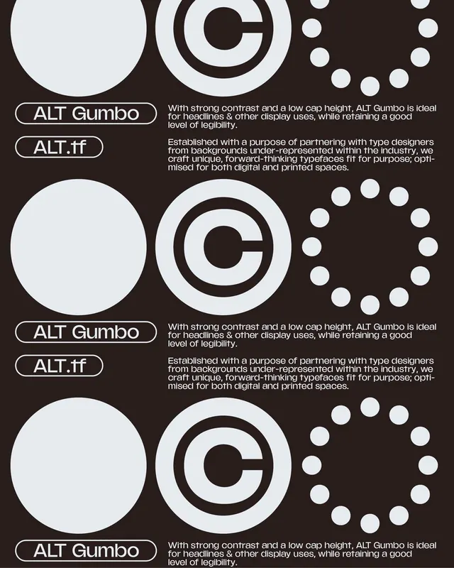
Dark type-foundry specimen for ALT Gumbo, repeating a row of solid circle, copyright symbol and dotted ring across three tiers with pill-framed labels and grotesque copy.
Summary
A type-foundry specimen for the "ALT Gumbo" typeface by ALT.tf, built from a repeated trio of off-white circular shapes, a plain disc, a bold copyright symbol, and a ring of dots, stacked over three near-identical tiers on a warm near-black ground. The marketing copy and labels are the only thing that changes between rows.
Visual description
The background is a very dark warm brown, almost black. Three horizontal tiers each carry the same left-to-right sequence of large pale geometric forms: a flat filled circle, a heavy circled-C copyright mark, and a circle drawn entirely from evenly spaced dots. Beneath the upper tiers sit two pill-outlined labels, "ALT Gumbo" and "ALT.tf", set in a chunky low-contrast grotesque, paired with two short paragraphs of body copy describing the typeface as ideal for headlines with strong contrast and a low cap height, and the foundry's mission to partner with under-represented type designers. The repetition top to bottom reads like a tiling sheet or scroll loop.
Key takeaway
Building a specimen out of one repeating geometric vocabulary, disc, copyright glyph, dotted ring, so the layout itself feels like a type system rather than just words on a page. The rounded pill frames around the foundry and typeface names turn plain labels into reusable brand tokens. Warm off-black instead of pure black softens an otherwise stark grid.
Reuse notes
A strong template for foundry releases, design-studio specimens, or any brand that wants its identity to feel systematic and modular. The repeating-row structure adapts cleanly to a vertical web hero or an animated scroll. Swap the three circular motifs for whatever shapes encode the brand. Best kept monochrome so the forms and copy, not color, carry it.
More like this






Keep what you find
A free account saves references to boards and can send you a weekly email of picks based on what you save.
To see every result, go Pro.