Preview image. Unlock full-res
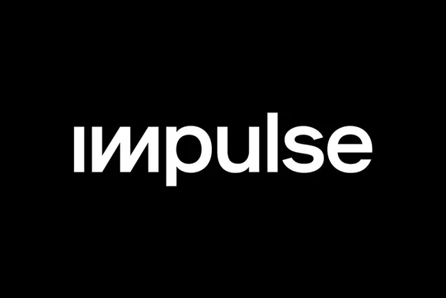
A lowercase white impulse wordmark on black whose opening i and m fuse into a continuous angled zigzag, turning the entrance of the word into a single jolting stroke.
Summary
A centered lowercase "impulse" logotype in white on black, where the leading "im" is drawn as one unbroken angled zigzag so the word appears to surge forward before settling into normal letterforms.
Visual description
A pure black field with the single word "impulse" centered in heavy white lowercase. The "i", "m", and into the "p" are reworked into a custom ligature of straight diagonal strokes that ramp up and down like a stitched seam or signal spike, dropping the i's dot and squaring off the m's arches. From "pulse" onward the letters return to a rounded, even-weight geometric grotesque, so the eye reads a sharp mechanical entrance resolving into a calm tail. Maximum contrast, no color, no secondary elements, generous black margin all around.
Key takeaway
The localized custom ligature: only the first two or three letters are redrawn into an angular motif that encodes the word's meaning (an impulse, a spike), while the rest stays a stock-clean sans so it still reads instantly. It is a cheap, high-impact way to make a one-word wordmark proprietary without a separate symbol.
Reuse notes
A model for tech, audio, fintech, or signal-related naming where the word itself suggests a shape. Pairs with a restrained monochrome system and lots of black space. Caveat: the zigzag only works because the surrounding letters are plain; redraw too many and legibility breaks. </content>