Preview image. Unlock full-res
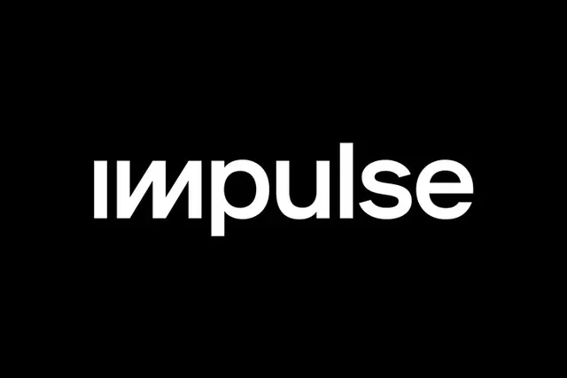
A lowercase wordmark with a custom looped-l ligature that ties the letters together, using a soft rounded sans on a black background.
Summary
A lowercase wordmark with a custom looped-l ligature that ties the letters together, using a soft rounded sans on a black background.
Visual description
White letterforms centered on black, set in a soft rounded sans with open counters throughout. The "l" in the middle bends into a flowing tail that curves back to connect with adjacent letters, creating a continuous gesture where the letter becomes a connective element. The rest of the word flows with even, generous spacing and rounded terminals. No symbol, no color variation, no tagline. Pure two-value contrast.
Key takeaway
A single custom ligature (the looped-l) becomes the entire distinguishing detail of an otherwise neutral rounded sans. This approach trades expensive full-custom lettering for a single high-impact glyph that's affordable to commission and legally defensible. The looping tail rewards close inspection while keeping the mark readable at a glance.
Reuse notes
Strong for consumer apps, marketplaces, or playful SaaS wanting an approachable lowercase wordmark without full custom type. The rounded letterforms feel friendly rather than corporate. Test the looped-l carefully at favicon and small-icon sizes, since the tail can collapse and lose legibility at very small scales. Reverse to black-on-white if your context needs a lighter touch.