Preview image. Unlock full-res
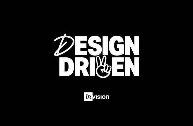
A stacked DESIGN DRIVEN wordmark in heavy white caps on black, where the D is swapped for a brush-script letter and the V becomes a hand throwing a peace sign.
Summary
A centered "DESIGN DRIVEN" wordmark stacked on two lines in heavy white grotesque caps on a black field, with two playful letter swaps: a brush-script D opening the top line and a drawn hand throwing a peace sign standing in for the V in DRIVEN. A small "in vision" logo sits below.
Visual description
Pure black background, white marks, no third color beyond the soft grey of the small footer logo. The two words sit tightly stacked and centered, set in a bold condensed sans with minimal tracking so the lines read as one block. The first letter of DESIGN is replaced by a loose, calligraphic brush "D" whose loop overlaps the E. In DRIVEN, the V is replaced by an illustrated hand making a peace sign, line weight matched to the type so the swap reads as a glyph rather than clip art. Beneath the lockup, centered, is a small "in" set in a filled rounded square followed by "vision".
Key takeaway
Substitute just one or two letters of an otherwise plain bold wordmark with hand-drawn elements (a brush stroke, an illustrated gesture) to inject personality without redrawing the whole logotype. Matching the illustration's stroke weight to the typeface is what makes it read as a single mark.
Reuse notes
Reach for this on campaign titles, event branding, or a creative-team identity that wants attitude but a quick build. The peace-sign gesture sets a youthful, confident tone; choose a substitution glyph that actually means something to the brand. Works best reversed (white on dark) so the heavy caps carry the contrast.
More like this
Keep what you find
A free account saves references to boards and can send you a weekly email of picks based on what you save.
To see every result, go Pro.