Preview image. Unlock full-res
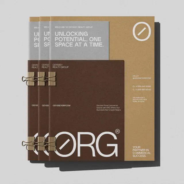
A stacked brochure mockup for Odyssey Realty Group in earthy brown, tan, and gray, with a circular slashed-zero monogram and big 'ORG' lettering.
Summary
A collateral mockup for Odyssey Realty Group showing three identical bound brochures fanned in a staggered stack over a tan back panel, held by brass bulldog clips. The brand's slashed-zero circle monogram appears small at top and again huge in the "ORG" logotype across the bottom.
Visual description
On a light gray surface, three saturated-brown booklet covers overlap left to right, each clipped at top and bottom with metal binder clips, casting soft drop shadows. The front cover carries small white copy "WELCOME TO ODYSSEY REALTY GROUP," a tagline "UNLOCKING POTENTIAL, ONE SPACE AT A TIME," and at the foot an oversized "ORG" wordmark whose O is a ring crossed by a diagonal slash, ending in a small registered mark. A tan vertical panel to the right holds the contact block (email, phone numbers, a New York address) and a second tagline, plus the circular monogram large in the corner. Palette is brown, tan, warm gray, and white only.
Key takeaway
A single geometric mark, a circle with a diagonal cut, scaled from a discreet corner glyph up to a page-filling logotype, gives the whole system one memorable shape at two registers. The brass bulldog clips and staggered stacking turn flat covers into a tactile, premium-feeling object.
Reuse notes
A good reference for real-estate, consulting, or B2B brands wanting warmth and restraint instead of the usual blue-and-white corporate look. The earthy palette reads premium without gloss. Reserve the oversized logotype for covers; it would overwhelm interior pages.
More like this



Keep what you find
A free account saves references to boards and can send you a weekly email of picks based on what you save.
To see every result, go Pro.