Preview image. Unlock full-res
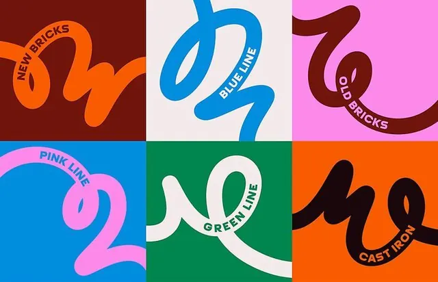
A six-panel identity grid where a single thick looping ribbon stroke names each variant, with curved labels like NEW BRICKS and BLUE LINE riding the line.
Summary
A six-panel brand grid built from one repeating element: a single fat looping ribbon stroke, recolored per panel, with each variant named in all-caps text that bends to follow the curve of the line.
Visual description
Two rows of three solid color blocks (oxblood, cream, pink, blue, green, orange) each hold the same thick monoline ribbon that doubles back on itself into loose loops. The stroke color flips per panel: bright orange on oxblood, blue on cream, brown on pink, pink on blue, cream on green, black on orange, always high contrast against its field. Small all-caps sans-serif labels (NEW BRICKS, BLUE LINE, OLD BRICKS, PINK LINE, GREEN LINE, CAST IRON) sit on a curved baseline that traces along the ribbon, so the text reads as part of the mark rather than a caption. No icons or photos; the line and the color carry everything.
Key takeaway
One fixed gestural stroke recolored across a palette is a fast way to generate a whole family of sub-brand marks that still read as one system. Setting the label on a baseline curved to the stroke welds type and graphic into a single unit. The hard color-block backgrounds let each variant own a swatch.
Reuse notes
Good for a parent brand with many named lines, routes, or product tiers that need to feel related but distinct. Works on packaging, transit or wayfinding systems, and event identities. Needs a confident curved-text setup and a palette with enough contrast pairs; flat on a single-color application.
More like this
Keep what you find
A free account saves references to boards and can send you a weekly email of picks based on what you save.
To see every result, go Pro.