Preview image. Unlock full-res
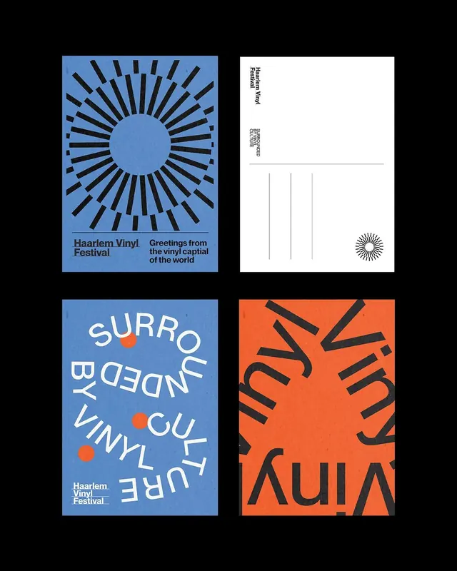
Haarlem Vinyl Festival identity with radial sunburst geometrics, blue and orange color blocking, and rotated all-caps typography defining a multi-format branding system.
Summary
Haarlem Vinyl Festival identity using a radial sunburst motif in bright blue paired with orange type on a stark white and black field, applied across posters and promotional materials.
Visual description
A four-part grid showing the core identity system. Top left: a dominant blue square with concentric black radial lines radiating from a light blue circle center, creating an intense sunburst effect, with festival name and tagline text below in sans-serif. Top right: a white-background card with black rotated text (reading "HAARLEM VINYL FESTIVAL"), a QR code above it, and a small sunburst icon in the corner. Bottom left: blue background with white and orange all-caps sans-serif type rotated diagonally, accompanied by address and festival name in small print. Bottom right: a bright orange square with large black sans-serif letters (VINYL, stacked with geometric precision), suggesting modular letter construction.
Key takeaway
The radial sunburst as the core visual anchor, instantly readable and energetic. Using two opposing directional treatments (horizontal typography on top-left, rotated 45-degree type on bottom-left) to create dynamism within a structured grid. The blue-orange pairing cuts through noise without requiring imagery or gradients.
Reuse notes
Strong reference for event or festival branding that needs boldness without photography. Works well for vinyl, music, or counterculture-adjacent brands. Rotation and geometric patterning reward real-size print application; less effective when compressed to favicon scale.
More like this
Keep what you find
A free account saves references to boards and can send you a weekly email of picks based on what you save.
To see every result, go Pro.