Preview image. Unlock full-res
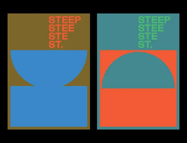
Two side-by-side posters for STEEP ST. use the same telescoping caption and half-circle geometry, swapping olive/blue and teal/red colorways to show one system in two palettes.
Summary
Two posters shown as a pair on black, each repeating the words STEEP / STEE / STE / ST. as a telescoping stack of shrinking lines, anchored by a large half-circle and rectangle in bold flat color blocks.
Visual description
The left poster sits on an olive-brown field: an orange caption telescopes down the upper right, losing a letter per line, while a blue half-bowl and a blue rectangle below it stack into an hourglass-like form using the brown ground as negative space. The right poster runs the identical type system in green over a teal upper field, with a red lower block and a teal dome cut into it, an exact inversion of the left's figure-ground relationship. Both use the same flat geometry, no gradients, no outlines, just hard-edged shapes and a single condensed all-caps sans. The black surround frames the two as a deliberate comparison.
Key takeaway
The telescoping caption, dropping one letter per line so the word visually fades or recedes, is a cheap, memorable typographic device. Equally useful is the two-up colorway presentation: same shapes and grid, different palettes side by side, which is exactly how you sell a flexible identity system rather than a one-off poster.
Reuse notes
Good reference for a brand or event identity built on a small kit of geometric shapes that can recombine and recolor across applications. Present variants in pairs or grids on a neutral background to show the system flexing. Keep the shape vocabulary tight, half-circle plus rectangle here, so the recolors read as one family rather than separate designs.
More like this

Keep what you find
A free account saves references to boards and can send you a weekly email of picks based on what you save.
To see every result, go Pro.