Preview image. Unlock full-res
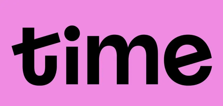
Lowercase wordmark spelling \"time\" in a heavy black geometric sans, centered on a flat hot-pink field with cut, angled terminals on the t and e.
Summary
A lowercase logotype reading "time" set in a heavy, near-geometric rounded sans, black on a flat hot-pink ground. The defining move is the angled, knife-cut terminals on the "t" and "e" that tilt against the otherwise upright, mechanical letterforms.
Visual description
The word fills the horizontal center of a saturated pink rectangle with generous margins top and bottom. Letters are extra bold with consistent stroke weight and tight spacing. The "t" has a sharply sloped crossbar and a diagonally sheared top, and the "e" terminates on a matching angled cut, while the "i" carries a large separated dot. Counters in the "m" and "e" stay open and round. Only two colors are used: dense black type on the pink field, no outlines, gradients, or texture.
Key takeaway
The diagonal slice across the "t" and "e" terminals injects motion into a heavy, static sans without adding any ornament. Pairing a punchy two-color flat ground (black on hot pink) with one oversized lowercase word reads instantly as a confident logotype.
Reuse notes
Good starting point for a consumer or media brand mark that wants warmth and approachability rather than corporate polish. The single sheared-terminal detail is the personality, so keep the rest of the system restrained. Works on any saturated single-color ground; test legibility if the pink drops to a tint.
More like this
Keep what you find
A free account saves references to boards and can send you a weekly email of picks based on what you save.
To see every result, go Pro.