Preview image. Unlock full-res
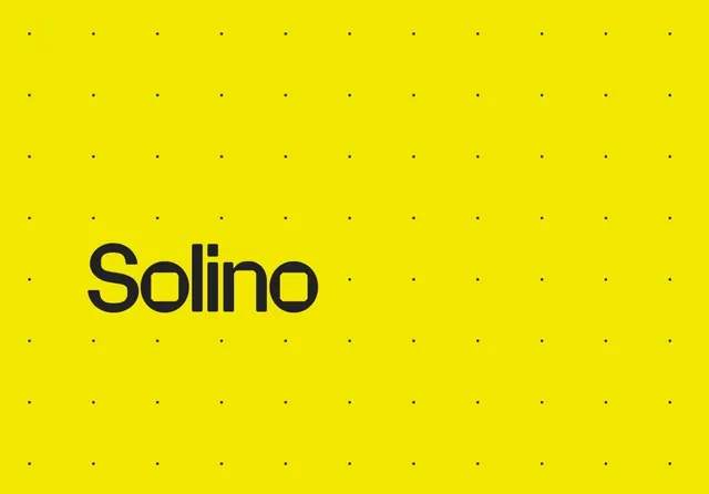
The Solino wordmark in a rounded black geometric sans, set lower-left over a saturated yellow field patterned with a faint dot grid.
Summary
A single-color logotype reading "Solino" in a rounded geometric sans-serif, black on a bright yellow background. The defining detail is the faint dot grid underlying the field, hinting at the construction grid behind the letterforms.
Visual description
The lowercase-then-capital wordmark sits in the lower-left third of a landscape yellow frame, leaving the upper and right areas open. Letters are heavy, monolinear and rounded, with a distinctive single-story "a"-style geometry and softly squared terminals that feel engineered on a grid. A regular matrix of small dark dots covers the whole background at low contrast, reading as a faint construction or layout grid rather than a loud pattern. Just two values do all the work: black mark, yellow ground. No tagline, icon, or supporting text.
Key takeaway
The faint dot grid quietly references the logo's own construction system and adds texture to a flat color field without competing with the mark. Placing the wordmark off-center, low and left, lets the empty yellow do the framing instead of centering everything by default.
Reuse notes
A good model for an app or consumer brand that wants one ownable color plus a friendly geometric wordmark. The dot-grid backdrop is reusable as a system motif across cards, slides, and packaging. High-energy yellow needs careful contrast checking for any small text placed on it.
More like this







Keep what you find
A free account saves references to boards and can send you a weekly email of picks based on what you save.
To see every result, go Pro.