Preview image. Unlock full-res
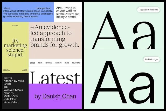
Multi-panel brand/strategy guide with distinct color fields (blue, yellow, pink, mint, purple), navigation tabs, client roster, serif display type specimen on mint background.
Summary
Multi-panel editorial guide with bold color blocking, typography specimens in serif and sans-serif, client list, and navigational metadata for a strategy consultancy.
Visual description
A horizontal layout divided into distinct colored sections. The left third features a bright yellow band with sans-serif copy ("It's marketing science, stupid") and a periwinkle band above showing the studio's about-statement in blue. A muted beige/tan panel spans the middle with serif display copy ("An evidence-led approach to transforming brands for growth") and smaller sans-serif navigation tabs below (Latest, News, Editorial, Insights, Cases, Field Notes). The right side is dominated by a soft mint background showcasing large black display type (a serif typeface), with font names labeled in white pills (Reckless Neue Book, PP Radio Light). Below that, a magenta/purple band lists clients (Kitchen by Mike, Grill'd, IKU, Workout Meals, Nandos, Mister Zimi, Vida Glow, Pime Video) with byline credit to "Danish Chan" and "Bo".
Key takeaway
Confident use of color fields to separate information without using borders or containers. The pairing of serif and sans-serif for hierarchy and emphasis. Client logos or names as social proof placed prominently without dominating. Metadata (tabs, bylines, credits) integrated seamlessly without cluttering the main message. The specimen-style type display directly references the typefaces used in the guide itself.
Reuse notes
Strong template for strategy or consultancy brand guidelines. The color blocking works especially well for multi-service studios or agencies. The mint background is softer than white, reducing glare while still reading as clean. Client list placement signals confidence and track record. Works best for digital presentation (website, portfolio case study). The layout assumes a wider aspect ratio; may need adaptation for mobile viewing.
More like this



Keep what you find
A free account saves references to boards and can send you a weekly email of picks based on what you save.
To see every result, go Pro.