Preview image. Unlock full-res
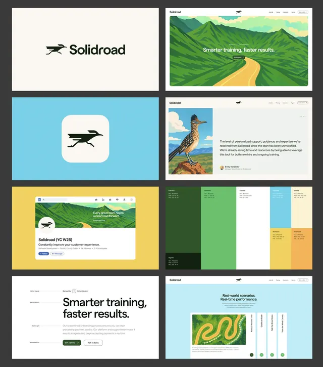
An eight-panel brand identity board for Solidroad pairing a roadrunner mark and wordmark with illustrated landscape web mockups, a hex-coded color grid, and a type scale.
Summary
A brand identity case-study board for "Solidroad" laid out as eight white cards on a dark grey ground, walking through logo, app icon, web pages, testimonial, color system, and typography in one frame.
Visual description
Eight rounded panels sit in a four-row, two-column grid against near-black. Top left is the horizontal lockup: a solid black roadrunner silhouette beside the lowercase serif-tinged wordmark "Solidroad" on cream. Below it the same bird mark appears as a rounded-square app icon on a sky-blue tile. The right column holds website mockups using flat illustrations of rolling green hills with a winding yellow road, headline "Smarter training, faster results.", plus a customer testimonial card with a roadrunner photograph, and a LinkedIn company-profile mockup on a yellow background. The lower-right panel is a color grid of stacked swatches (forest green, teal, white, golden yellow, dark night-green) each annotated with HEX, RGB, and HSL values. The final panel shows a left-rail type scale (Regular, Medium, Light) against the oversized headline. Illustration style is flat with limited tonal banding; UI is clean and airy.
Key takeaway
Presenting an entire identity as a single grid of equally sized cards reads as a finished system at a glance and is ideal for a portfolio thumbnail. Anchoring an otherwise corporate SaaS brand on a literal animal mascot (the roadrunner) plus flat landscape illustration gives warmth without losing professionalism. Color swatches carrying HEX, RGB, and HSL together make the board double as a usable spec sheet.
Reuse notes
A reference for assembling a brand-reveal board or case-study hero, especially for a B2B or SaaS product that wants approachable illustration over stock photography. Best when every card shares one corner radius and the same internal margins, as here. Skip the dark backdrop if the deliverable will live on a light site.
More like this




Keep what you find
A free account saves references to boards and can send you a weekly email of picks based on what you save.
To see every result, go Pro.