Preview image. Unlock full-res
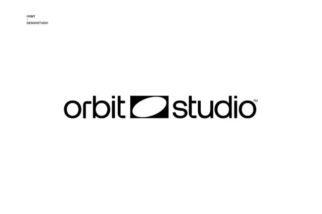
A black lowercase 'orbit studio' wordmark on white, split by a solid black square containing a white lens-shaped ellipse that acts as the connecting brand glyph.
Summary
A monochrome horizontal wordmark reading "orbit studio" in heavy lowercase geometric sans, with a black square holding a white lens ellipse bridging the two words. The defining move is the square glyph that reads simultaneously as a divider, an eye, and an orbiting body.
Visual description
Centered on a white field, the lockup runs horizontally: "orbit" on the left, a solid black square in the middle, "studio" on the right with a small superscript trademark mark. Inside the square sits a white ellipse tilted slightly off horizontal, with a thin angled stroke through it, suggesting a lens, an eye, or an orbital path. The type is a rounded geometric grotesque at heavy weight, tightly spaced, all lowercase. Top left, a tiny stacked label reads "ORBIT / DESIGNSTUDIO". Strictly black on white, no other color.
Key takeaway
The black-square negative-space glyph doing triple duty as wordmark connector, brand symbol, and conceptual icon (lens/orbit) so a single mark carries the whole identity. Dropping a small mark between two words is a compact lockup pattern that scales cleanly to a favicon by cropping to just the square.
Reuse notes
Strong default for a design studio, creative agency, or product brand wanting a confident monochrome identity. The square-glyph-between-words structure adapts to any two-word name. Keep the type heavy and the spacing tight or the glyph stops feeling load-bearing.