Preview image. Unlock full-res
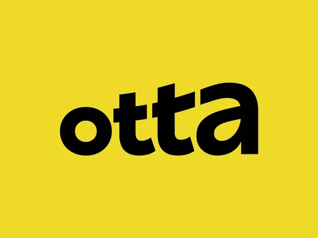
A bold lowercase 'otta' wordmark in black on a saturated yellow field, with angled flat-cut terminals giving the rounded geometric letters a forward lean.
Summary
A single-color lowercase logotype, "otta", set heavy and black on a flat saturated yellow ground. The defining detail is the angled, flat-cut terminals on the stems that tilt the whole word into a slight forward motion.
Visual description
The wordmark sits centered, slightly below the optical middle, occupying roughly the central third of a yellow field with generous empty margin all around. Letters are lowercase, rounded, and very heavy, with near-circular bowls on the "o" and "a". The vertical stems of the two "t" letters are sheared at a diagonal across the top, and the right side of the final "a" carries the same angled cut, so the strokes look clipped on a slant. No tagline, no mark, just type on color.
Key takeaway
The angled flat-cut terminals are the whole idea: a single repeated detail that gives an otherwise plain geometric sans a sense of speed and personality. Holding the logo to one heavy weight on one loud color keeps it instantly recognizable at any size.
Reuse notes
A strong template for a consumer or tech brand that wants warmth and energy without an icon. Yellow-on-black gives maximum daylight visibility but fails on accessibility for small body text, so reserve this pairing for the logo and headlines, not paragraphs.