Preview image. Unlock full-res
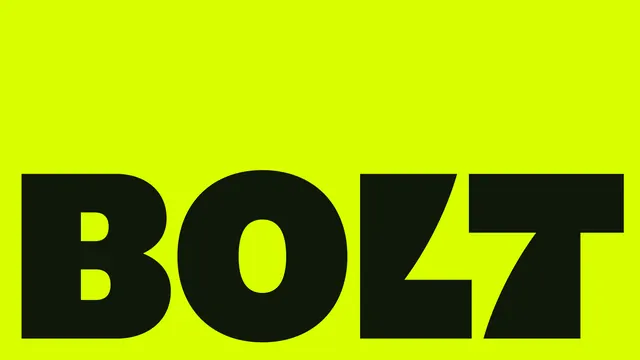
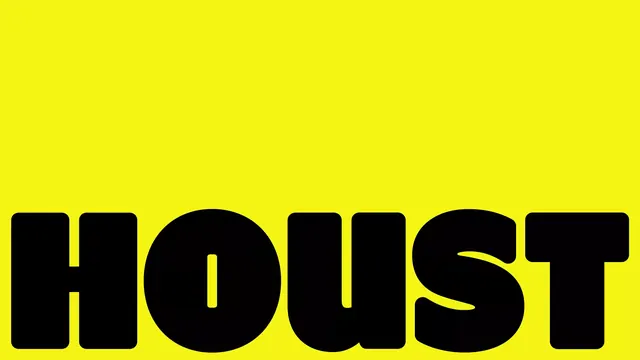
The wordmark HOUST in a heavy rounded black grotesque, sat hard on the baseline of a full-bleed acid-yellow field with the top two thirds left empty.
Summary
A single black word, HOUST, in an extra-heavy rounded sans, anchored flush to the bottom edge of a saturated yellow field. The whole top two thirds of the frame is deliberately empty.
Visual description
Full-bleed acid yellow (near #F4F513). The wordmark is set in a very fat, rounded grotesque with near-circular O and U bowls and almost no internal spacing, so the letters nearly touch. It runs edge to edge across the bottom of the frame and is cropped where it meets the baseline, giving it weight and a poster-like crop. Only two colors are present, yellow and black. No tagline, no symbol, no secondary element, just the type and the vast empty yellow above it.
Key takeaway
Anchoring the wordmark to the bottom edge and leaving the upper frame empty: the negative space does as much branding work as the type, and the layout doubles as a ready-made cover or social card with room for nothing or for one later headline. The rounded, nearly-touching grotesque reads as friendly-but-loud.
Reuse notes
Reach for this when one word is the entire brand and you want maximum shout from minimum ink. The acid yellow plus pure black is a high-contrast pairing that survives at thumbnail and screen-print scale. Caveat: yellow-on-black or black-on-yellow can vibrate at small sizes, and the bottom crop only works on a full-bleed surface, not inside a padded container.