Preview image. Unlock full-res
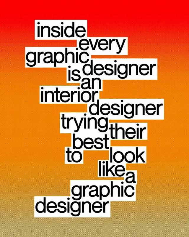
A typographic poster spelling a designer in-joke in bold black words on individually placed white blocks, stacked into a ragged column over a fiery vertical gradient.
Summary
A tall poster where each word of a multi-line designer in-joke sits on its own white rectangle in heavy black type, the blocks loosely stacked and offset into a leaning column against a vertical gradient burning from deep red at the top to bright orange-yellow below.
Visual description
The words are set one or two per white block in a bold condensed sans-serif, sized inconsistently so some blocks are wide and others tight, and they are nudged left and right rather than aligned, producing a jittery ransom-note rhythm down the center. The black-on-white blocks read as hard knockout shapes punched into the saturated background. That background is a smooth top-to-bottom gradient moving through crimson, scarlet, and orange into a pale warm glow at the foot of the frame, lending heat behind the otherwise neutral type. Negative gradient space frames the stack on both sides.
Key takeaway
Putting each word on its own white slab and then stacking them out of alignment turns a plain sentence into a built, almost physical object, the offsets create motion without any imagery. Hard black-and-white type blocks read cleanly over even an intense gradient because they never touch the color directly.
Reuse notes
Reach for this when a single line of copy or a punchy quote needs to be the whole composition, on a poster, cover, or social card. The white-block treatment guarantees legibility over any loud or photographic background. Vary block widths and offsets deliberately or it flattens into a normal centered headline.
More like this



Keep what you find
A free account saves references to boards and can send you a weekly email of picks based on what you save.
To see every result, go Pro.