Preview image. Unlock full-res
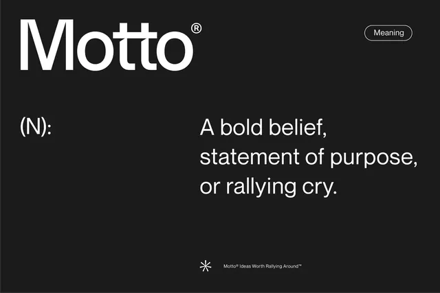
Black brand card that frames the agency name Motto as a dictionary entry, pairing a large wordmark with an (N): part-of-speech label and a three-line definition in clean white sans-serif.
Summary
A brand card that presents the agency name as a dictionary entry, leading with a large Motto wordmark and following with an (N): label and a three-line plain-language definition, all white on near-black.
Visual description
The layout is near-black with everything in white. Top-left sits the wordmark "Motto" in a large clean sans with a small superscript registered mark. Top-right, an outlined pill capsule holds the single word "Meaning." Below, the page splits left-to-right: a small "(N):" part-of-speech label on the left, and on the right a three-line definition set large, "A bold belief, statement of purpose, or rallying cry." Centered at the bottom, a small asterisk-style brand glyph precedes the fine-print tagline "Motto Ideas Worth Rallying Around." Generous negative space surrounds each block, and the type does all the work with no imagery or rules.
Key takeaway
Framing the brand name as a literal dictionary definition, complete with the "(N):" part-of-speech tag and registered mark, which makes the name feel authoritative and self-documenting. Also the pairing of an oversized wordmark with a much larger, friendly definition line so the page reads as both logo and manifesto in one frame.
Reuse notes
Reach for this for agency or studio brand slides, manifesto pages, and about-section openers where the name carries a concept worth defining. Works as a template: swap in any noun, its part of speech, and a one-line definition. Pairs with a strict mono palette and a single accent pill. The conceit only lands if the definition is genuinely punchy.
More like this





Keep what you find
A free account saves references to boards and can send you a weekly email of picks based on what you save.
To see every result, go Pro.