Preview image. Unlock full-res
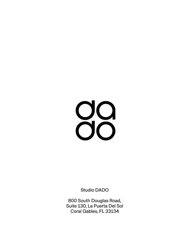
The Studio DADO identity sets the word dado twice in a rounded geometric sans whose o and a counters read as four circles, stacked into a near-square monogram block.
Summary
A black-on-white studio mark that stacks the lowercase word "dado" into two rows ("da" over "do"), so its four rounded letter bowls line up as a 2x2 cluster of circles reading as a monogram.
Visual description
A tall white card, with the mark sitting just above center. The wordmark is a heavy rounded-geometric lowercase sans set on two lines: "da" above "do", tightly tracked so the circular counters of the a's and o's form a balanced quad. Far below, with a wide empty gap, a small centered text block reads "Studio DADO" and a three-line Coral Gables, Florida address in a lighter regular weight of the same family. Pure black type on flat white, no color, no rule lines, lots of breathing room top and bottom.
Key takeaway
Stack a short lowercase name so its repeated round letters auto-assemble into a symmetrical monogram. The wordmark and the logo become the same object, no separate icon needed.
Reuse notes
Ideal for a studio or agency whose name has repeating round letters; pairs naturally with a stationery or business-card system. The trick depends on the right rounded sans and tight tracking; loose spacing breaks the square-cluster read.