Preview image. Unlock full-res
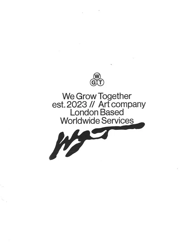
Centered black-on-white identity lockup stacking a three-circle W/G/T monogram, descriptive sans-serif copy, and a loose ink scrawl signature.
Summary
A centered black-on-white brand lockup for "We Grow Together" that contrasts a tidy geometric monogram against a loose, gestural ink signature directly below it.
Visual description
On a plain white field, the lockup is stacked and centered. At the top sits the monogram: three outlined circles arranged in a triangle, each holding a letter, W at top, G and T below, reading WGT. Beneath it, four lines of centered grotesque sans-serif set the descriptor: "We Grow Together / est. 2023 // Art company / London Based / Worldwide Services." Below the type, a thick black brushy scrawl, an abstract handwritten signature mark, sweeps left to right with a long trailing flick, its weight and looseness deliberately clashing with the neat geometry above. Wide white margins surround everything.
Key takeaway
The deliberate contrast of two registers: a precise, contained geometric monogram set against a raw, gestural ink mark in the same black. That tension reads as "structured studio with a human, artistic hand." The three-circle triangular monogram is also a clean way to pack three initials into one compact mark.
Reuse notes
Good for an art studio, creative practice, or small agency that wants to look organized yet hand-made. Keep it strictly monochrome so the scrawl stays the only expressive element. The signature mark can be lifted on its own as a stamp or favicon.