Preview image. Unlock full-res
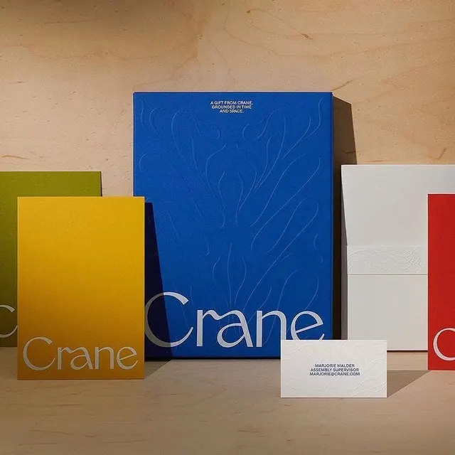
A Crane-branded stationery and packaging set, photographed on birch plywood, where saturated blue, yellow, and red folders share one elegant serif logotype and blind-embossed leaf motifs.
Summary
A photographed Crane stationery and packaging set where bold primary-color folders are unified by a single curvy serif logotype and subtle blind-embossed botanical motifs. The defining move is letting saturated color blocks carry the identity while keeping type and texture quiet.
Visual description
Five upright pieces lean against a warm birch plywood wall on a matching wood surface: a cobalt blue gift box (largest, centered), a mustard yellow folder, an olive green card peeking at left, a white folder at right with debossed line work, and a red card behind it. Each carries the lowercase serif wordmark "Crane" set large in a contrasting tint. The blue box reads "A GIFT FROM CRANE, GROUNDED IN TIME AND SPACE" in small white caps at top and shows ghosted, embossed leaf-and-stem shapes across its face. A white business card lies flat in front, blind-embossed with "MARJORIE MALDER / ASSEMBLY SUPERVISOR / MARJORIE@CRANE.COM" and a tonal organic pattern. Lighting is soft and directional, raking across the embossing.
Key takeaway
Use a single distinctive serif logotype across an entire kit and let color, not layout variation, differentiate each piece. Pair flat saturated stock with blind embossing so the texture only reads under raking light, adding craft without adding ink. The warm plywood backdrop neutralizes loud primaries and makes the set feel tactile and premium.
Reuse notes
A strong reference for a paper, gift, or heritage-goods brand that wants to feel both playful and refined. Works best when the photography can control raking light to reveal the deboss. The primary palette is energetic, so reserve it for brands that can carry boldness; swap to muted stock if a calmer read is needed.
More like this




Keep what you find
A free account saves references to boards and can send you a weekly email of picks based on what you save.
To see every result, go Pro.