Preview image. Unlock full-res
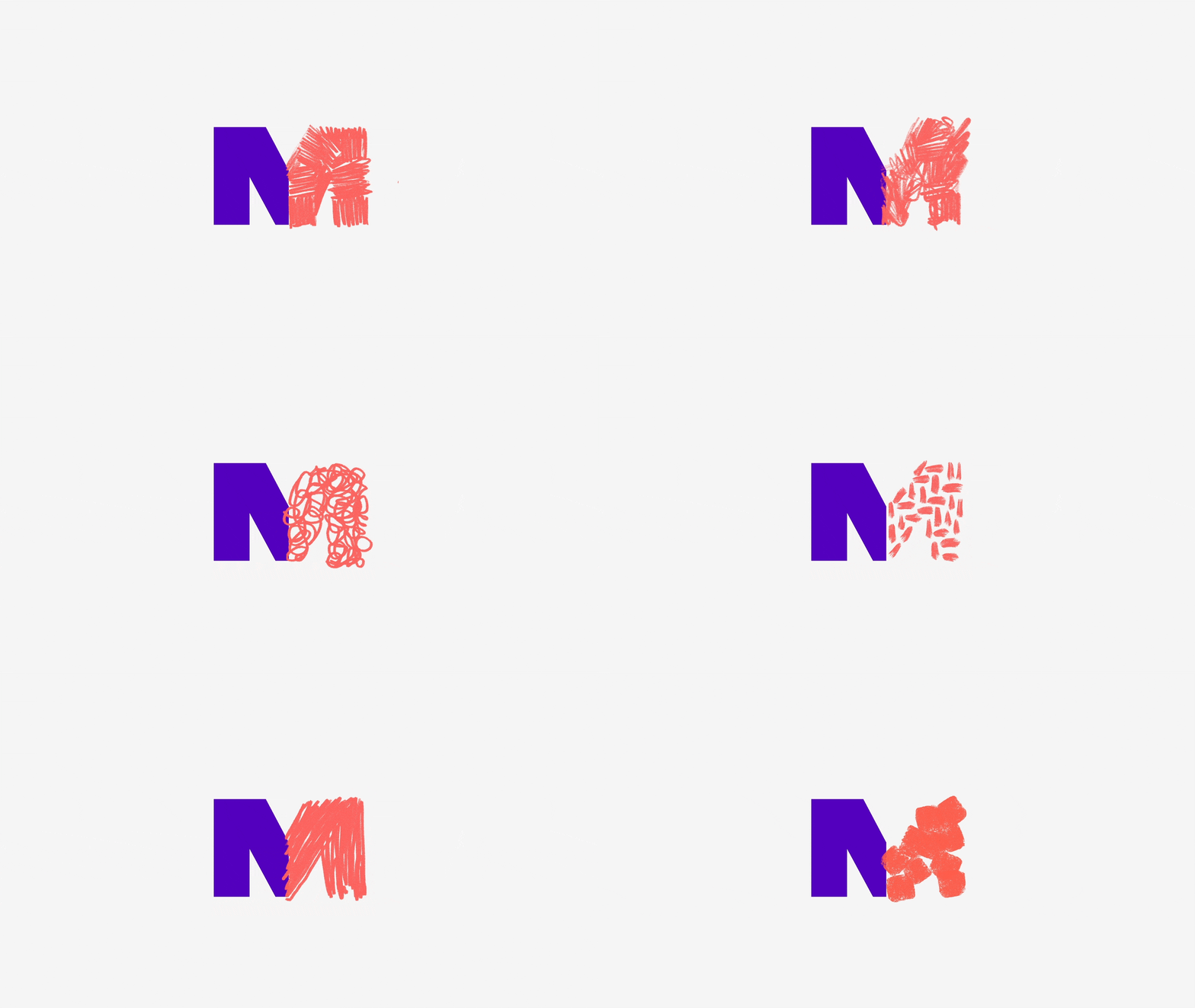
A logo-style letter M built from two contrasting halves: a solid deep-purple geometric left stroke fused to a scribbled coral hand-drawn right stroke on near-white.
Summary
A single oversized letter M centered on a near-white field, split down the middle into two opposite treatments: a flat, vector-clean purple left half and a loose, sketchy coral right half.
Visual description
The mark fills only the center of an otherwise empty light-gray canvas, so the surrounding negative space is most of the frame. The left stroke and apex are rendered as a solid, hard-edged deep-violet shape with crisp diagonals. At the vertical midline the form switches abruptly to a coral-red right half drawn as dense overlapping pencil or crayon scribbles, with visible stray strokes breaking the silhouette. The two halves share the same letter skeleton but read as machine-made versus hand-made. Being a GIF, the two halves likely animate or alternate; the captured frame shows both states fused.
Key takeaway
Build one glyph from two opposing rendering modes (flat vector plus hand-scribbled) split on a clean axis, so a single letterform carries the whole "structure meets craft" story without any tagline.
Reuse notes
Strong for a studio or agency monogram that wants to signal both rigor and creativity. The scribble half needs real hand texture to avoid looking like a filter. Works best huge and centered with lots of empty space around it.
More like this




Keep what you find
A free account saves references to boards and can send you a weekly email of picks based on what you save.
To see every result, go Pro.