Preview image. Unlock full-res
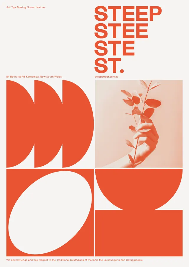
A vibrant orange and cream identity built on stacked, tall letterforms paired with abstract organic shapes and botanical imagery.
Summary
A vibrant orange and cream identity built on stacked, tall letterforms paired with abstract organic shapes and botanical imagery.
Visual description
Bright red-orange sans-serif letterforms arranged in a tall, stacked column spelling "STEEP" with descending scale. Left side shows abstract curved forms (swooping arcs stacked vertically, like petals or sound waves) also in red-orange on off-white. Top-right carries a botanical illustration of branching leaves and stems in the same red-orange on pale pink. Lower section features large geometric shapes: white circles and curves cutting into solid red-orange squares. The grid-like layout uses bold negative space to separate distinct compositions, each exploring the same warm palette and organic/geometric contrast.
Key takeaway
The use of descending letterform scale to add visual rhythm and intrigue. The pairing of precise geometric blocks with organic, flowing shapes to create narrative contrast. The unified color strategy where a single vibrant hue anchors botanical, typographic, and abstract elements.
Reuse notes
Strong for creative studios, art collectives, and editorial brands seeking bold, personality-driven identity. Works well in large-format applications where the geometric/organic interplay commands the space. Type-led with enough visual storytelling to avoid feeling cold.
More like this



Keep what you find
A free account saves references to boards and can send you a weekly email of picks based on what you save.
To see every result, go Pro.