Preview image. Unlock full-res
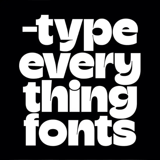
A four-line stacked type lockup in an ultra-bold rounded sans, where tight leading and scaled-to-fit text make letterforms into a solid graphic block.
Summary
A four-line stacked type lockup in an ultra-bold rounded sans, where tight leading and scaled-to-fit text make letterforms into a solid graphic block.
Visual description
White lowercase text fills nearly the entire black square, set in an ultra-heavy rounded sans where fat, swollen letterforms have bulging counters that nearly close. The four lines read "-type / every / thing / fonts" with each line scaled edge-to-edge to fill its width. Leading is compressed, forcing the four rows to lock into a single dense rectangular shape. The rounded, slightly liquid terminals of the typeface keep the aggressive weight friendly rather than severe. No additional imagery or ornament. High-contrast white and black carry the entire visual impact.
Key takeaway
Let a single heavy display typeface become the complete brand by scaling each word to fill its line width and pulling leading tight. The combination forces type into a graphic shape where the negative space inside letterforms becomes a compositional element. The rounded, open letterforms soften an otherwise punishing weight, making bold feel approachable.
Reuse notes
Effective for type foundries, music labels, zines, or any brand where letterform personality is the main asset. Choose a typeface with genuine character in the counters and terminals. Generic bold sans faces will feel flat. Reverse to black-on-white for lighter applications. Best for headlines and logotypes where the lockup reads as a single shape rather than individual words.
More like this



Keep what you find
A free account saves references to boards and can send you a weekly email of picks based on what you save.
To see every result, go Pro.