Preview image. Unlock full-res
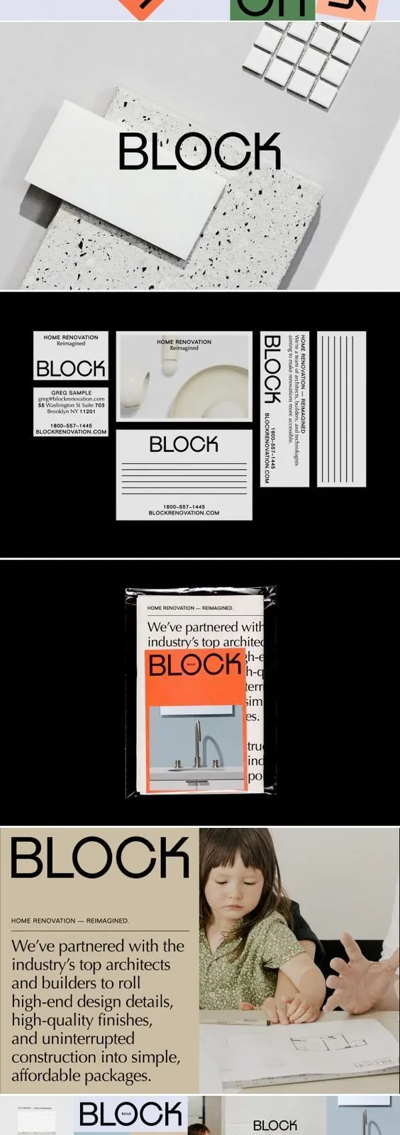
A stacked identity case study for BLOCK, a renovation brand, opening with rotated and recolored wordmark tiles, then moving through terrazzo samples, stationery, and web mockups.
Summary
A vertical identity case study presenting BLOCK, a home-renovation brand, with a rotated-wordmark color grid at the top, followed by tactile applications and web implementations stacked downward.
Visual description
The composition reads top to bottom as a continuous visual narrative. Opening panel shows the chunky geometric BLOCK wordmark repeated eight times, each instance rotated at a different angle and set on its own colored rectangle (cream, sage green, coral, dark green, light pink). Below sits a terrazzo and tile flat-lay with the BLOCK logo embossed or printed on a white marble slab. Next, a black-ground row displays stationery items: a cream letterhead, a business card for Greg Sample, and a lined note sheet, all reading Home Renovation Reimagined in minimal sans serif. A shrink-wrapped printed piece follows with a coral faucet photograph and partial body text visible through the plastic. A wider cream-ground editorial spread pairs a paragraph of brand manifesto with a photograph of hands sketching architectural plans. The composition concludes with a multi-device web mockup (desktop, tablet, phone) overlaid on bathroom and kitchen photography. A small PINTHEMALL.NET credit appears at the base.
Key takeaway
Opening an identity deck with the same wordmark rotated and recolored across a grid instantly communicates flexibility and the full color palette in one gesture. Anchoring the logo on tactile real-world materials (terrazzo, shrink-wrap, marble) establishes the system as functional before any digital mockup appears. Restraint in stationery (black and cream) lets the sage and coral accents carry all the personality.
Reuse notes
A strong layout template for identity case studies, especially for architecture, interiors or renovation brands. The rotated-wordmark grid works standalone as a lockup or system-flexibility slide. Note that this is a tall composite at small scale across many panel sizes, so use it as a systems-and-sequencing reference rather than a source for detailed legibility on individual applications. Best shown full-height to read the progression.
More like this

Keep what you find
A free account saves references to boards and can send you a weekly email of picks based on what you save.
To see every result, go Pro.