Preview image. Unlock full-res
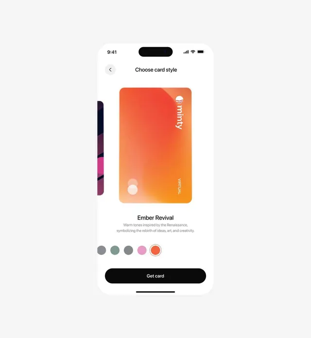
A fintech app screen where users pick a card finish, showing a glossy orange gradient virtual card in a carousel above a named theme, color swatches, and a black Get card button.
Summary
A clean light-mode fintech onboarding screen for choosing a card finish, anchored by a glossy orange-to-amber gradient virtual card sitting in a peek-ahead carousel.
Visual description
A single iOS phone frame floats centered on a pale gray backdrop. The status bar shows 9:41 with a pill notch, and a back chevron and centered Choose card style title sit at the top. The hero is a tall rounded virtual card filled with a warm orange to amber gradient, glossy and slightly metallic, carrying the minty wordmark and a sun-wave logo top-right and a small VIRTUAL label bottom-right; two translucent dots sit bottom-left. A second darker magenta card peeks in from the left edge, signaling a swipeable carousel. Below the card, a bold Ember Revival theme name sits over two lines of muted gray descriptive copy, then a row of five circular color swatches with the active orange one ringed for selection. A full-width black pill button reading Get card closes the screen above the home indicator.
Key takeaway
Make a configurable product the hero by giving it a real gradient finish and showing the next option peeking in from the edge, so the carousel affordance is obvious without arrows. Pair a named, narrative theme label (Ember Revival) with a selectable swatch row so a simple color choice feels editorial.
Reuse notes
Reach for this on card or product personalization flows in fintech, neobank, or any app where a user customizes a physical or virtual object. The black pill CTA against a near-white screen keeps the single action unmistakable. Needs a genuinely good gradient render to carry the hero; flat fills would deflate it.
More like this






Keep what you find
A free account saves references to boards and can send you a weekly email of picks based on what you save.
To see every result, go Pro.