Preview image. Unlock full-res
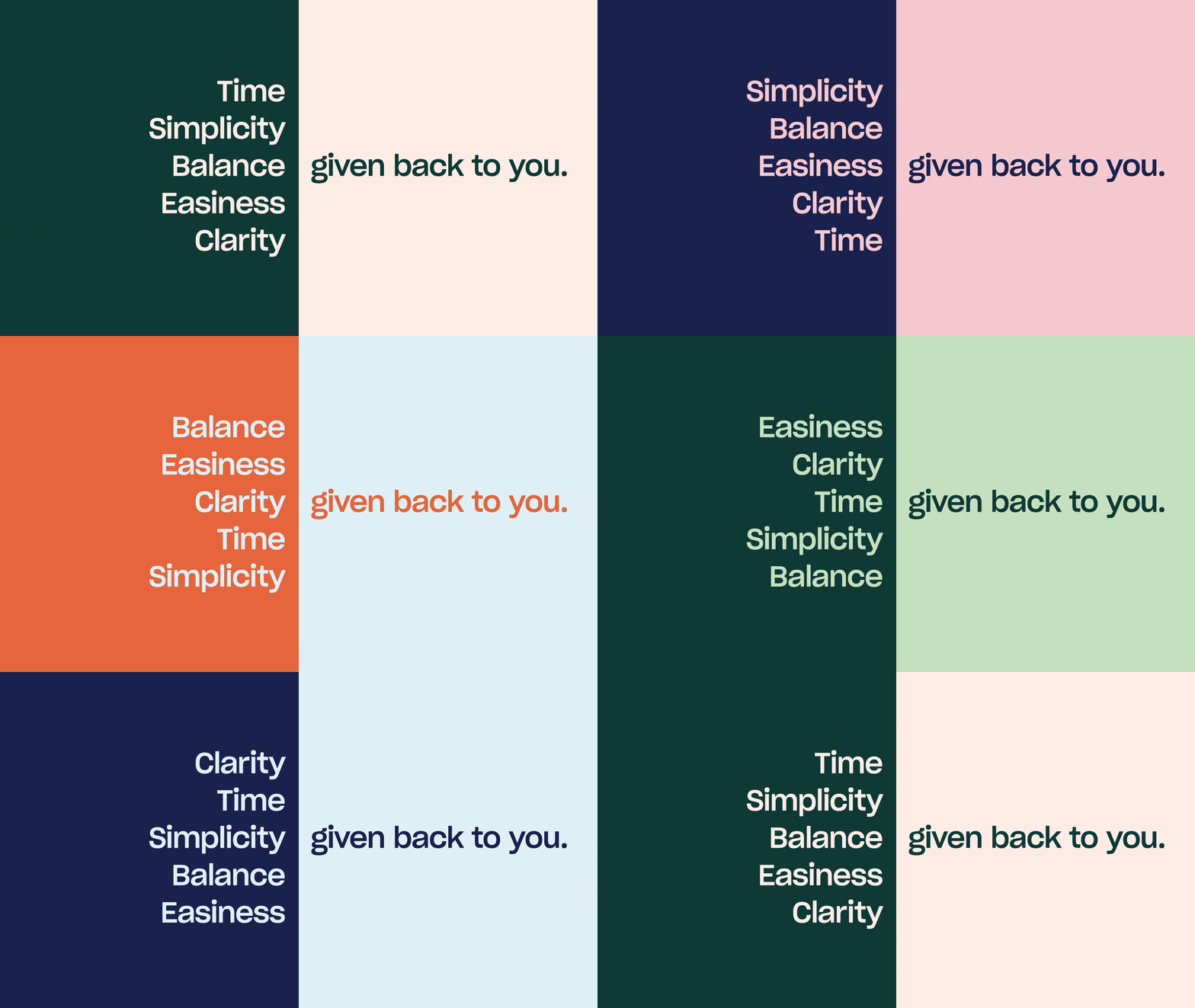
Vertical split layout pairing stacked single-word benefits against a five-word payoff line, in forest-green and sage-green duotone.
Summary
A vertical split divides two tonal greens; the left half stacks five single-word benefits in pale type, while the right half completes the phrase with a five-word payoff line in dark green, reading as one sentence across the seam.
Visual description
A hard vertical seam divides the layout. Forest-green left panel right-aligns the stack "Easiness / Clarity / Time / Simplicity / Balance" in medium-weight sans-serif, each word at the same size, hugging the dividing edge. Soft sage-green right panel mirrors the alignment with "given back to you." in bold, larger type, anchored to the same seam. No additional imagery, ornament, or decoration; generous negative space surrounds both groups. The two-tone pairing reads as a continuous sentence flowing across the color boundary.
Key takeaway
Splitting a complete utterance across a hard color division—part of speech on one side, predicate on the other—forces the eye to read left-to-right and binds the two panels as one cohesive unit. The tight hue range between the two greens (forest to sage) preserves calm while the scale contrast between the stacked benefit words and the oversized payoff creates clear hierarchy without additional visual noise.
Reuse notes
Effective for value-proposition or benefits-slide layouts in wellness, coaching, B2B, or productivity decks. The stacked format adapts well to animated reveals (benefits appearing in sequence). The muted dual-green works best when the two hues are close enough to feel like a palette family rather than a hard wall; if separated too wide, the seam reads as a border.
More like this




Keep what you find
A free account saves references to boards and can send you a weekly email of picks based on what you save.
To see every result, go Pro.