Preview image. Unlock full-res
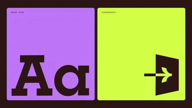
A two-panel brand-system sheet pairing a slab-serif Aa specimen on lavender with a custom exit-door arrow icon on lime, both inside rounded tiles on a dark brown ground.
Summary
A landscape brand-system sheet split into two equal rounded tiles on a dark brown field: a slab-serif "Aa" specimen on lavender and a custom door-with-arrow exit icon on lime.
Visual description
Two square rounded-corner tiles sit side by side on a deep espresso-brown background with even gutters. The left tile is lavender, labeled "SHARP SLAB" in a tiny tracked monospace eyebrow at top left, with an oversized brown slab-serif "Aa" anchored to the bottom left, the slab serifs reading as crisp rectangular feet. The right tile is acid lime, labeled "ICONOGRAPHY" the same way, holding a brown pictogram of an open doorway with an arrow passing through it, sitting bottom right. Every element is flat, no gradients or shadows; the brown ink is shared across both tiles so the two halves read as one system.
Key takeaway
The format itself: a brand guideline shown as labeled, color-coded tiles where each tile isolates one system element (type, then icon). The tiny monospace section eyebrow against the giant subject is a clean way to caption a specimen. Reusing one ink color (brown) across two loud backgrounds ties unrelated panels together.
Reuse notes
Good template for brand guideline slides, style-tile decks, or a portfolio grid where you want to present type and iconography as a matched set. The lime/lavender pairing is high energy; swap the two tile colors for the brand palette while keeping the shared dark ink and the eyebrow-plus-oversized-subject structure.