Preview image. Unlock full-res
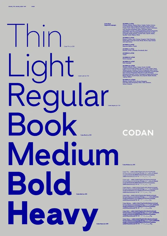
A gray type specimen poster ramping the CODAN typeface from Thin to Heavy as a stacked left column, with blue spec annotations and notes running down the right.
Summary
A portrait type specimen poster for the typeface CODAN, where the left column stacks the weight names from Thin down to Heavy in that actual weight, turning the word list into a visible ramp of stroke thickness.
Visual description
A light warm-gray sheet holds everything in a single deep-blue ink. The left column lists the weights top to bottom, Thin, Light, Regular, Book, Medium, Bold, Heavy, each set large in its own weight so the strokes thicken progressively down the page. The word CODAN sits set in white as a label partway down the right side. Small blue caption text and dense annotation blocks run along the right margin, anchored to a tight grid. Generous gray space separates the headline ramp from the supporting notes.
Key takeaway
Showing each font weight by setting its own name in that weight, so the specimen demonstrates and labels itself at once. The single-ink blue-on-gray scheme keeps a content-heavy layout calm, and the white type label breaks the monochrome just enough to read as a key reference point.
Reuse notes
A reusable layout for any font release, foundry one-pager, or brand type page that needs to communicate a weight range at a glance. Pairs well with a second sheet showing character sets or sizes. The self-demonstrating ladder only works for the weight axis; widths or italics would need a different device.
More like this





Keep what you find
A free account saves references to boards and can send you a weekly email of picks based on what you save.
To see every result, go Pro.