Preview image. Unlock full-res
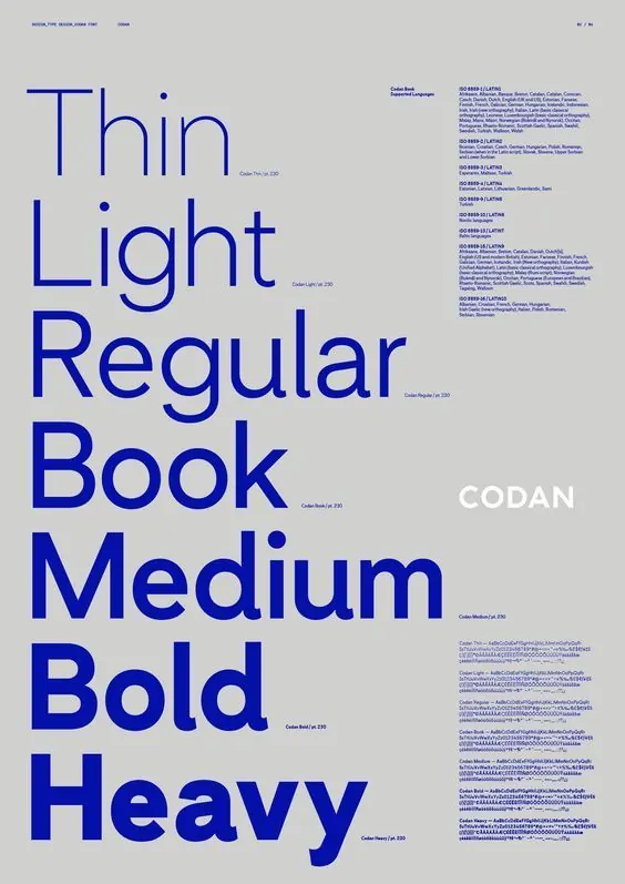
Type specimen for the CODAN sans-serif typeface displaying weight progression from Thin to Heavy across a neutral grid.
Summary
Type specimen for CODAN, a geometric sans-serif, displaying weight progression from Thin to Heavy on a light gray grid with supporting metadata organized to the right.
Visual description
Vertical layout with left-aligned word "Thin Light Regular Book Medium Bold Heavy" stacked in blue sans-serif type, each line in its corresponding weight, anchored on a light gray background. "CODAN" appears in white lower-right. Right column lists metadata in small blue text: color block, description, and technical specifications for each weight. Grid structure visible as faint horizontal and vertical dashed lines anchoring the layout. No imagery beyond type and structural elements.
Key takeaway
The straightforward weight progression method: stack the same word or phrase in each weight variant without additional styling, so the typeface speaks for itself. The right-column specification grid keeps technical details scannable without visual noise. Using a single color (cobalt blue) with white background and pale grid lines maintains clarity while avoiding distraction.
Reuse notes
Standard reference for any foundry or type-focused publication. Works best for sans-serifs with complete weight families. Educational context or specimen catalogs; pairs well with detailed character-set sheets or usage guidelines on subsequent pages.
More like this




Keep what you find
A free account saves references to boards and can send you a weekly email of picks based on what you save.
To see every result, go Pro.