Preview image. Unlock full-res
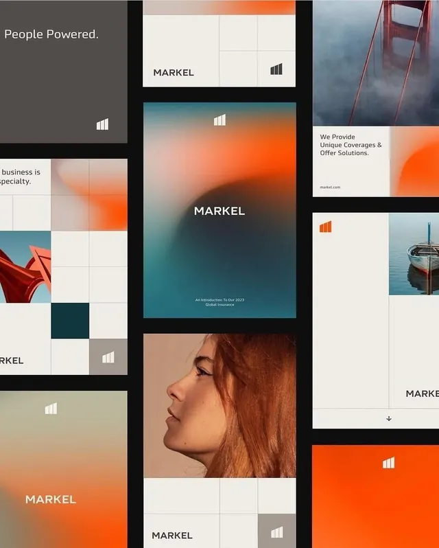
Markel's modular grid-based brand system combines warm orange and teal with photographic imagery and clean sans-serif typography across application mockups.
Summary
Markel's modular grid-based brand system combines warm orange and teal with photographic imagery and clean sans-serif typography across application mockups.
Visual description
A comprehensive brand system layout showing the Markel wordmark and visual language applied across multiple formats. The grid structure uses a clean 3x3 module framework throughout, filled with variations: the logo repeated in white on dark gray, teal, and orange grounds; taglines like "People Powered" and "We Provide Unique Coverages & Offer Solutions" in sans-serif; photographic details (a woman's profile, a red architectural element, an ocean scene) integrated into the grid cells; and solid color blocks in the brand palette (warm burnt orange, muted teal, cream, dark gray). Black separators define the modular frame, creating clear visual compartments for each application variant.
Key takeaway
The modular grid as a structural template for brand applications. A narrow, consistent color palette (three accent tones plus neutrals) that scales from small logos to full-page layouts. Using photography as one module option alongside solid color and type, building cohesion without repetition.
Reuse notes
Ideal for B2B or corporate insurance brands needing a structured, extensible identity. The grid discipline shows how to apply a logo and color language across presentations, websites, and collateral in a controlled way. Works especially well when clients require multiple application contexts in one system overview.
More like this
Keep what you find
A free account saves references to boards and can send you a weekly email of picks based on what you save.
To see every result, go Pro.