Preview image. Unlock full-res
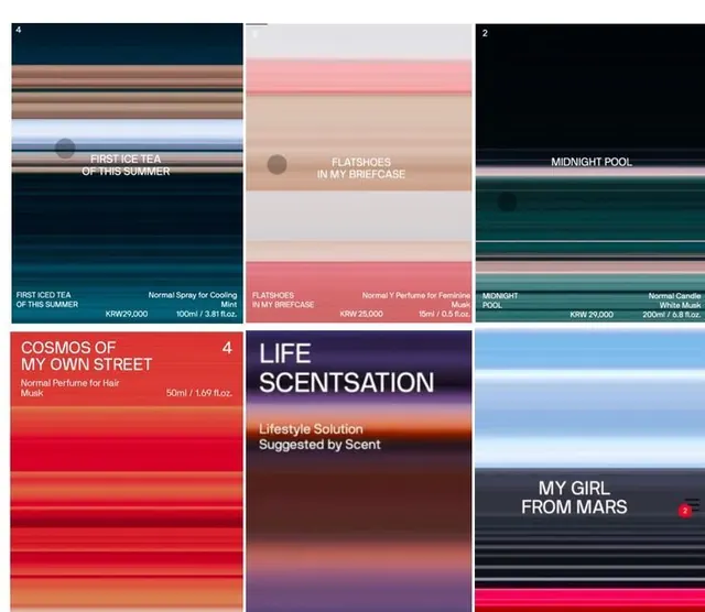
A six-up grid of fragrance product cards where each scent is represented by a horizontally striped, motion-blurred color gradient labeled with a poetic name, price in won, and volume.
Summary
A fragrance catalog laid out as a 3x2 grid of product cards, each scent shown only as a horizontally striped, motion-blurred gradient with a named title, a price in Korean won, and a volume spec.
Visual description
Six rectangular cards in two rows. Each card is filled top to bottom with thin horizontal stripes of color blurred into a soft gradient, evoking a swatch of liquid or light: deep navy and teal, dusty pink and beige, near-black green, saturated red, and pale blue. Card names sit in small caps near the center ("FIRST ICE TEA OF THIS SUMMER", "FLATSHOES IN MY BRIEFCASE", "MIDNIGHT POOL", "COSMOS OF MY OWN STREET", "MY GIRL FROM MARS"), while one card breaks the system with a large left-aligned "LIFE SCENTSATION" display lockup. A footer strip on each card gives a "Normal..." product line, price in KRW, and milliliter / fl oz volume. Small round dots and tiny numerals act as quiet UI markers.
Key takeaway
Representing each product purely as a striped, motion-blurred color field instead of a photo, so the gradient itself becomes the brand signifier. Pairing surreal, poetic scent names with a rigid spec footer (price, volume) for an editorial-meets-retail tension.
Reuse notes
Strong reference for fragrance, candle, or beauty catalogs that want an art-directed alternative to product photography. Works as a menu, lookbook spread, or e-commerce grid. The naming voice carries a lot of the brand, so the copy has to be as considered as the gradients.
More like this




Keep what you find
A free account saves references to boards and can send you a weekly email of picks based on what you save.
To see every result, go Pro.