Preview image. Unlock full-res
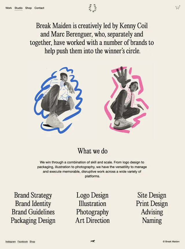
Centered editorial about-page for studio Break Maiden, pairing cut-out duo-tone portraits with serif headlines and a two-column services list on warm off-white.
Summary
An about-page layout for creative studio Break Maiden, built around a centered serif intro paragraph and two cut-out founder portraits each backed by a loose hand-drawn scribble in blue and magenta.
Visual description
The page sits on a warm off-white background with a slim navigation bar up top (Work, Studio, Shop, Contact). A short centered intro in a refined serif names founders Kenny Coil and Marc Berenguer and describes the studio. Below it, two black-and-white cut-out photographs of people are placed side by side, each set against a scribbled outline, one blue, one pink-magenta, that frames the figure like a halo. A small centered "What we do" serif heading introduces a paragraph, then a balanced two-column list of services in sans-serif: Brand Strategy, Brand Identity, Brand Guidelines, Packaging Design on the left; Logo Design, Illustration, Photography, Art Direction, plus Site Design, Print Design, Advising, Naming on the right. A tiny footer arrow and social labels close the page.
Key takeaway
The scribble-behind-cutout portrait treatment: a flat duo-tone photo plus a single loose ink loop adds personality and hand-made warmth without any real illustration skill, and the two contrasting scribble colors differentiate the two founders. Centering everything and letting the serif paragraph carry the intro keeps a content-light page feeling considered.
Reuse notes
Reach for this on a studio or freelancer about/team page where you have two or three principals and a services list but little other content. Pairs well with a muted warm palette and a single accent-color scribble per person. Needs decent cut-out masking on the portraits; sloppy edges will undercut the deliberate look.
More like this




Keep what you find
A free account saves references to boards and can send you a weekly email of picks based on what you save.
To see every result, go Pro.