Preview image. Unlock full-res
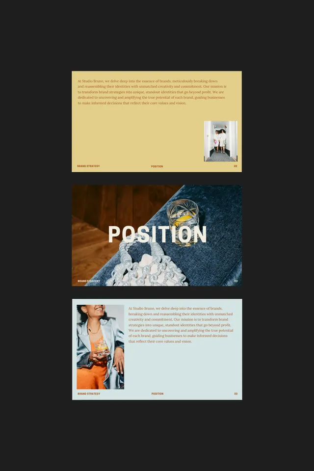
A three-panel editorial layout pairing warm earthy typography cards with photography of natural textures, seascapes, and people in ochre and deep teal tones.
Summary
A three-section editorial layout pairing cream and pale-blue type cards with full-bleed photography of ocean horizons, natural textures, and portrait figures, unified by a warm ochre and cool teal colour story.
Visual description
Three distinct rectangular panels are stacked vertically. The top panel features pale cream-coloured cardstock with small text (likely body copy or project description). The middle panel is dominated by a full-bleed photograph of a dark ocean horizon with a snow-capped mountain or iceberg, overlaid with large white sans-serif type reading "POSITION". The bottom panel pairs a portrait photograph of a figure in an ochre-toned garment against a muted blue-green background with a light cyan card containing small text. The overall composition balances photography and typography through colour harmony: warm ochres and browns anchor the naturalistic imagery, while cool teals and creams provide visual breathing room and frame the content.
Key takeaway
The sophisticated use of warm and cool colour blocking to unify diverse photographic content; the layout's rhythm created by alternating full-bleed imagery with minimalist type cards; the technique of using a bold, oversized heading (POSITION) at modest scale relative to the full bleed, creating intimate focus without competing with the image; the muted, analogous colour palette that feels editorial and premium.
Reuse notes
Ideal for design portfolios, agency case studies, luxury brand presentations, or editorial spreads. Works well for projects with strong photographic assets and a clear narrative arc. The alternating image-card structure scales to multiple pages and feels contemporary without trendy fussiness.
More like this



Keep what you find
A free account saves references to boards and can send you a weekly email of picks based on what you save.
To see every result, go Pro.