Preview image. Unlock full-res
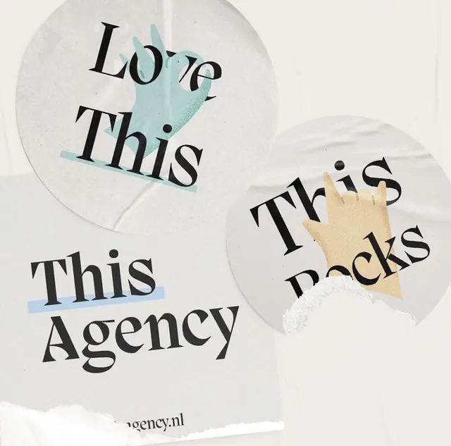
Agency identity pairing serif typography with watercolor hand gestures in teal and tan, arranged on cream-colored circular backgrounds.
Summary
A branding system pairing black serif headlines with watercolor hand illustrations in teal and warm tan, arranged in circular cream-colored modules.
Visual description
Three cream-colored circles (two large, one small) contain layered typography and illustration. The top-left circle holds "Love This" in a bold, serif display face, overlaid with a teal watercolor hand reaching inward. The top-right circle contains "This Packs" with a tan-yellow watercolor hand gesturing below the text. The bottom-left circle shows "This Agency" in serif type with a light blue underline accent. The entire composition sits on a warm, off-white paper background. The watercolor hands have soft, grainy edges and feel human and craft-made. All elements rest in spacious, balanced negative space.
Key takeaway
Pairing formal serif typography with soft, hand-painted gesture breaks corporate coolness without sacrificing professionalism. Circular framing creates intimate containment and modularity. The duotone hand palette (teal and tan) is warm and approachable without being cloying. This structure works as a repeatable system for taglines or service offerings.
Reuse notes
Perfect for boutique agencies, design studios, or consultancies wanting warmth without whimsy. The serif face keeps it serious; the watercolor hands make it human. The circular modular format scales to business cards, web hero sections, or collateral layouts. The warm earthy palette (cream, tan, teal) is contemporary and gender-neutral. Avoid if a sterile or purely digital aesthetic is required.
More like this


Keep what you find
A free account saves references to boards and can send you a weekly email of picks based on what you save.
To see every result, go Pro.