Preview image. Unlock full-res
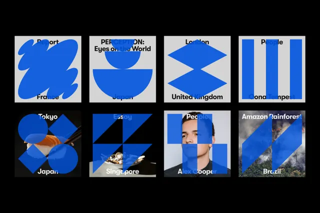
Eight location-based logo concepts using bold blue geometric shapes subdivided into symbolic map-like forms, each labeled with a city or country name.
Summary
A grid of eight location-branded symbols, each a bright blue geometric form subdivided into a map-like shape and labeled with a city or country (Paris, London, Tokyo, Singapore, Australia, and others).
Visual description
Eight 3x3 inch squares on a white background, each containing a bold, cobalt-blue main shape subdivided by smaller geometric cutouts or divisions suggesting location or identity. Thick geometric sans-serif labels in white or black appear below or beside each form. The overall effect is a systematic identity system where each location gets a unique geometric silhouette defined by blue fill, white space, and sharp angles. Grid layout, 2x4 arrangement, uniform square frames.
Key takeaway
The system of deriving a unique geometric silhouette for each location by subdividing a simple blue shape into a map-like abstraction. Strong, replicable approach for multi-location brands. The consistent color, stroke, and scale across the grid creates unity and scannability.
Reuse notes
Useful for global brands, multi-office studios, or location-based services (delivery, travel, real estate) that need a simple, memorable icon per locale. Scales well to icon sizes and works equally at 16px and 1200px due to the bold, defined geometry. Pairs well with minimal sans-serif type.