Preview image. Unlock full-res
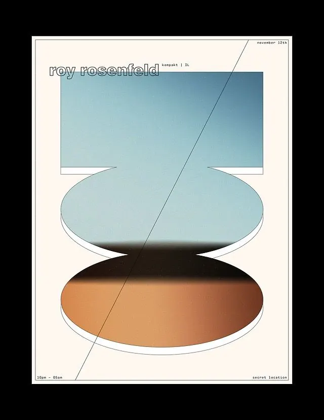
An event poster stacking a blue-to-amber gradient form into discs over cream, with lowercase outline type and a single diagonal hairline cutting the frame.
Summary
A music or event poster built from a single gradient slab sliced into a square panel and two thinning discs, shifting blue at top to amber at bottom over a cream sheet.
Visual description
On a thin-bordered cream sheet, one central form is cut into three stacked planes: a flat-bottomed blue panel at top, a wide elliptical disc beneath it, and a smaller amber disc at the base, each with a thin white edge that reads as a physical thickness. The fill runs a smooth gradient from cool muted blue down through a dark seam into burnt orange. A lone diagonal hairline runs corner to corner across the whole layout. Lowercase outline type reads "roy rosenfeld" at upper left with "kompakt | IL" beside it, and small mono-style metadata anchors each corner: "november 12th," "10pm to 05am," "secret location."
Key takeaway
The depth trick: extruding flat ellipses with a thin white rim so a 2D gradient reads as stacked physical objects, and tying the whole sheet together with one full-bleed diagonal hairline. Hollow outline lettering keeps the headline quiet against the loud gradient.
Reuse notes
A clean template for gig, club night, or release announcements where one striking abstract form carries the poster and corner text holds the logistics. The gradient sequence does the mood work; swap the hue ramp per event. Outline type can get fragile at small sizes. </content>
More like this
Keep what you find
A free account saves references to boards and can send you a weekly email of picks based on what you save.
To see every result, go Pro.