Preview image. Unlock full-res
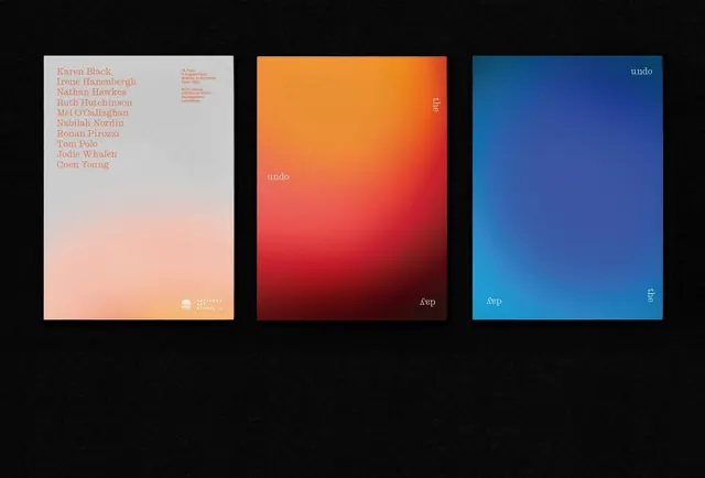
A three-poster set for a National Art School group show, pairing a typographic artist list with two full-bleed orange-to-red and blue gradient panels and rotated serif captions.
Summary
A three-panel exhibition poster set for a National Art School group show, contrasting one quiet text poster against two atmospheric full-bleed gradient posters that carry the words "undo / the / day" rotated into the corners.
Visual description
Three vertical posters sit side by side on a deep black, slightly textured ground. The left poster is a soft warm-grey panel fading to peach at the bottom, holding a left-aligned list of ten artist names in a peach serif, a small block of event details top-right, and a white NAS logo lock-up bottom-right. The center poster is a saturated mesh gradient running orange at the top into deep red at the bottom; the right poster mirrors it in cyan-to-cobalt blue. On both gradient panels the words "undo", "the", and "day" are set small in a light serif and scattered to the corners, some rotated 90 or 180 degrees so the type reads as fragments rather than a headline.
Key takeaway
Treat a poster series as one system: hold the type style constant and let a single full-bleed gradient be the only variable from panel to panel. Rotating and scattering a three-word phrase into the corners of otherwise empty fields turns plain copy into a quiet conceptual device that ties the set together.
Reuse notes
Strong template for an art exhibition, festival, or gallery campaign where you have one information-bearing panel and several mood panels. The gradients need to be genuinely rich to carry near-empty posters, so render them as smooth mesh blends rather than flat two-stop ramps. Works best printed large or shown as a mounted set.
More like this
Keep what you find
A free account saves references to boards and can send you a weekly email of picks based on what you save.
To see every result, go Pro.