Preview image. Unlock full-res
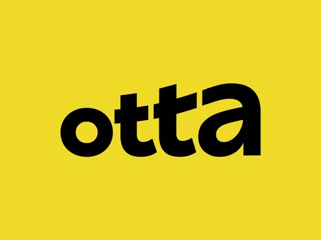
The Unmind wordmark set in a soft, rounded brown serif over a flat bright-yellow field, friendly and high-contrast.
Summary
The single-word logotype "Unmind" in a heavy, rounded serif, dark brown on a saturated yellow background. The warmth comes from the serif's soft, almost organic terminals rather than from any second color.
Visual description
One line of type, horizontally centered, filling most of the frame width with generous side margins of flat yellow. The face is a bold serif with chunky weight and gently rounded, slightly irregular serifs and terminals, giving it a retro, hand-cut feel rather than a crisp digital look. It is set in lowercase except for the leading capital U. The "i" carries a round dot, and the d and other ascenders rise above the x-height to add rhythm. Strict two-color treatment: warm dark brown letterforms on a single bright yellow ground, no shading, outline, or texture.
Key takeaway
Using a soft, slightly wonky serif (not a sans) to make a one-word logotype feel friendly and approachable while still reading bold. Pairing it with a single loud, warm background color does all the energy work, so the type itself can stay calm.
Reuse notes
Strong template for a wellbeing, lifestyle, or consumer brand that wants warmth without looking childish. The two-color, full-bleed-color approach makes it portable to app icons, packaging, and social. Caveat: the specific yellow is loud, so confirm legibility and contrast of the brown on it for small sizes.