Preview image. Unlock full-res
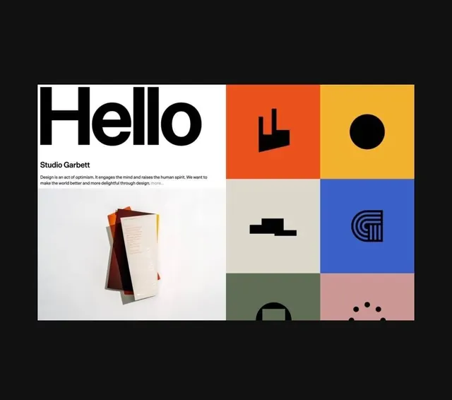
A studio homepage that pairs an oversized Helvetica 'Hello' intro panel with a grid of bright color-block tiles each holding one black logo mark.
Summary
A design-studio landing layout where a left half holds a giant black "Hello" headline, a studio name, mission copy and a flat-lay print photo, while the right half is a six-cell grid of saturated color tiles, each carrying a single bold black logo glyph.
Visual description
The composition sits on black and splits into two columns. Left: an oversized "Hello" in heavy black Helvetica-style type on white, then "Studio Garbett" and two lines of mission copy with a grey "more..." link, and below it a photograph of stacked translucent print collateral (orange, dark red, cream) shot from above on a pale surface. Right: a tight grid of square tiles in orange, yellow, beige, blue, sage green and dusty pink, each containing one chunky black abstract logo mark (an arrow-block, a filled circle, a stepped form, a monogram, a doorway shape, a dotted arc). The grid bleeds off the bottom of the frame. No gutters between tiles, so the color squares butt edge to edge.
Key takeaway
The two-mode layout: one quiet typographic intro panel balanced against a loud, gridded showcase of work. Putting each logo on its own full-bleed color tile makes a portfolio of marks read as a single cohesive system. The flat-lay print photo grounds the digital grid with something tactile.
Reuse notes
Strong template for a studio or agency homepage, an about section, or a logo-portfolio case study. The color tiles can be swapped per client palette. Caveat: each mark needs to survive at one color on a busy field, so it favors simple, high-contrast glyphs over detailed logos.
More like this





Keep what you find
A free account saves references to boards and can send you a weekly email of picks based on what you save.
To see every result, go Pro.