Preview image. Unlock full-res
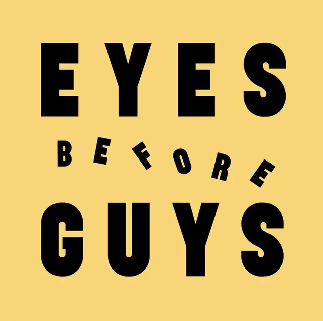
A square typographic graphic reading 'EYES BEFORE GUYS' in heavy black caps on mustard yellow, with the middle word scattered along a playful arc.
Summary
A square, two-color typographic piece spelling the slogan "EYES BEFORE GUYS" in heavy black uppercase on a mustard yellow ground. The single defining detail is the middle word "BEFORE", which breaks from the rigid grid and bounces along a loose upward arc with each letter individually rotated.
Visual description
Three lines of black sans-serif caps stack centered on a flat mustard-yellow field. "EYES" and "GUYS" are set huge, bold, and tightly tracked, filling the full width as solid horizontal bars of type. Between them "BEFORE" is much smaller and scattered: its letters ride a gentle curve, each tilted at a slightly different angle so the word feels hand-placed and bouncy. Only two values are used, black type on warm yellow, with no imagery or rules.
Key takeaway
Contrast a rigid, oversized headline with one small word that breaks the grid and arcs across the gap, so a flat slogan gets motion and personality for free. Individually rotating the letters of that one word reads as handmade against the machine-precise caps above and below. Two colors keep the joke clean.
Reuse notes
Good for slogan merch, social tiles, sticker packs, or any punchy one-liner that wants to feel witty rather than corporate. Pairs with a heavy geometric sans and a warm flat background. The arced-word move works on three to four word phrases; longer copy loses the rhythm.
More like this
Keep what you find
A free account saves references to boards and can send you a weekly email of picks based on what you save.
To see every result, go Pro.