Preview image. Unlock full-res
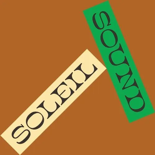
Two wordmarks rotated and stacked diagonally: a pale cream rectangle on the left angled one direction, a bright green rectangle on the right angled opposite, each with black sans-serif caps.
Summary
Two rectangular wordmarks arranged diagonally: a pale cream label angled lower-left with "SOLVE" in black caps, and a bright green label angled upper-right with "SOUND" in dark caps, against a warm rust-brown background.
Visual description
Two distinct rectangular text blocks dominate the composition, each rotated at opposing angles to create visual dynamism. The lower-left block is pale cream with "SOLVE" in dark sans-serif capitals, angled clockwise. The upper-right block is bright kelly green with "SOUND" in dark capitals, angled counter-clockwise. Both labels sit on a warm rust-brown ground, their rotation creating an implied motion or conversation between the two words. The typeface is geometric and clean, all-caps, with consistent stroke weight. The color strategy uses complementary contrast: the cool green pops against the warm brown and cream.
Key takeaway
Rotating paired wordmarks in opposing directions creates liveliness while keeping the layout intentional. Placing type on contrasting rectangular fields isolates each word while the background color unifies the whole. Using a warm earthy tone as a field color alongside a vibrant accent (green here) reads as natural yet energetic, suitable for consumer brands.
Reuse notes
Strong approach for brands with two-word or compound names, or those needing to balance multiple concepts. Works especially well in packaging and identity systems where the composition can be applied consistently. The rotation technique adds personality without whimsy. Test the label colors and background on various materials to ensure the contrast reads clearly.
More like this




Keep what you find
A free account saves references to boards and can send you a weekly email of picks based on what you save.
To see every result, go Pro.