Preview image. Unlock full-res
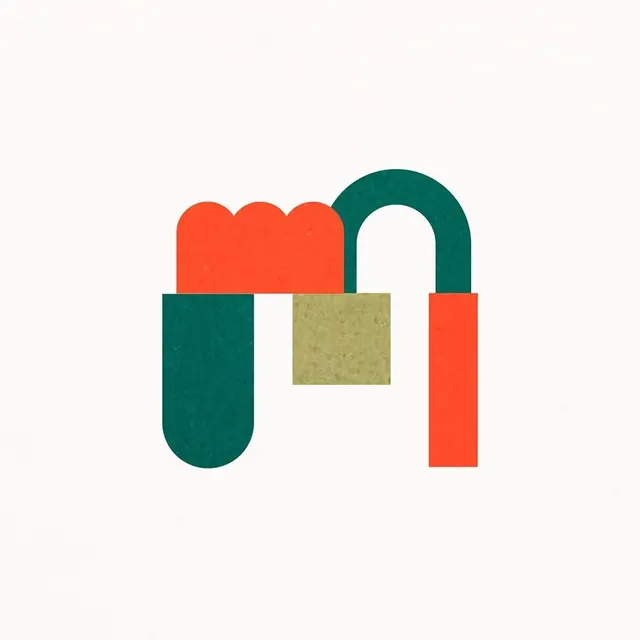
A bold orange letter 'M' monogram drawn as two rounded vertical pillars joined by a notched dip, centered on a warm grey background.
Summary
A solid orange monogram, readable as a chunky letter 'M' (or paired 'h' forms), built from two tall rounded-top pillars meeting at a short central notch. It sits centered and large on a warm putty-grey ground.
Visual description
The mark fills the middle of a near-square canvas with comfortable margins of soft grey on all sides. Two heavy vertical columns rise with rounded shoulders at top; the left column's inner edge curves down while the right mirrors it, and they connect low via a small stepped notch that creates the M's central valley. The bottoms are flat. The orange is a hot red-orange, completely flat with no gradient or outline, against a muted warm grey that keeps it from vibrating too hard. The shape is geometric and confident, equal parts letterform and abstract symbol.
Key takeaway
Construct a letter mark from two identical rounded pillars and resolve the join with a single small notch, so the negative space does the legibility work. Pair a hot orange figure with a warm desaturated grey ground so the color pops without the harshness of pure white.
Reuse notes
A clean default for a tech, product, or studio monogram that needs to work as an app icon at small sizes. The rounded-pillar construction gives a friendly-but-solid read. Swap the grey for any muted neutral; the mark carries on a single flat color. Pairs well with a plain geometric sans for the full lockup.