Preview image. Unlock full-res
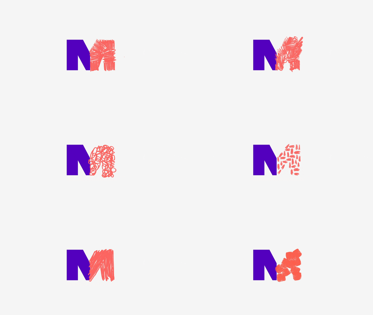
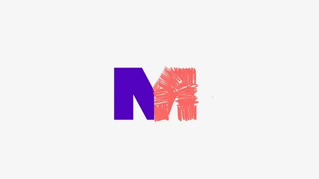
An abstract monogram combining a solid deep purple geometric form with a textured coral mark, using complementary colors for visual impact on a neutral ground.
Summary
A logo mark pairing a solid deep purple blocky form with a textured coral accent, employing complementary colors and geometric abstraction for strong visual identity.
Visual description
Against a light gray background, two abstract forms create a cohesive mark: a solid, blocky deep purple geometric shape (resembling an abstracted letterform or angular monogram element) positioned on the left occupies roughly a third of the composition; to its right sits a textured coral-salmon pink form with visible vertical hatching or scratch marks creating visual texture and movement. The two shapes are adjacent or slightly overlapping, creating a balanced, compact composition. The color opposition (deep indigo against warm coral) generates high visual contrast despite the minimal, flat treatment. No background shape or container; the mark stands isolated on the neutral ground.
Key takeaway
The complementary color opposition (purple-coral) creates visual energy without requiring additional colors or gradients; the textured element (hatching on the coral form) adds hand-made or expressive detail without sacrificing minimalism; the abstract letterform approach allows the mark to be both geometric and interpretable as type, working at all scales; the compact, centered composition reads clearly as both a logo and a dynamic pattern element.
Reuse notes
Effective for tech, creative, or modern service brands where boldness and forward-thinking are desired. The texture detail prevents the mark from feeling too corporate, making it suitable for design studios, software, or startups. Scales well to small sizes due to high contrast. Works equally in single-color (convert to purple or coral alone) or as shown. The hatching technique can be adapted to other mark elements; pair with minimal sans-serif for complete brand identity.